Kawaiicon website
Hypercard cuteness
Visual design, interaction design, front-end development May 2019Kiwicon is New Zealand's Hacker Con. In 2019, the Crüe embarked on a lighter version of the con: Kawaiicon.
Go to live site →A fine line
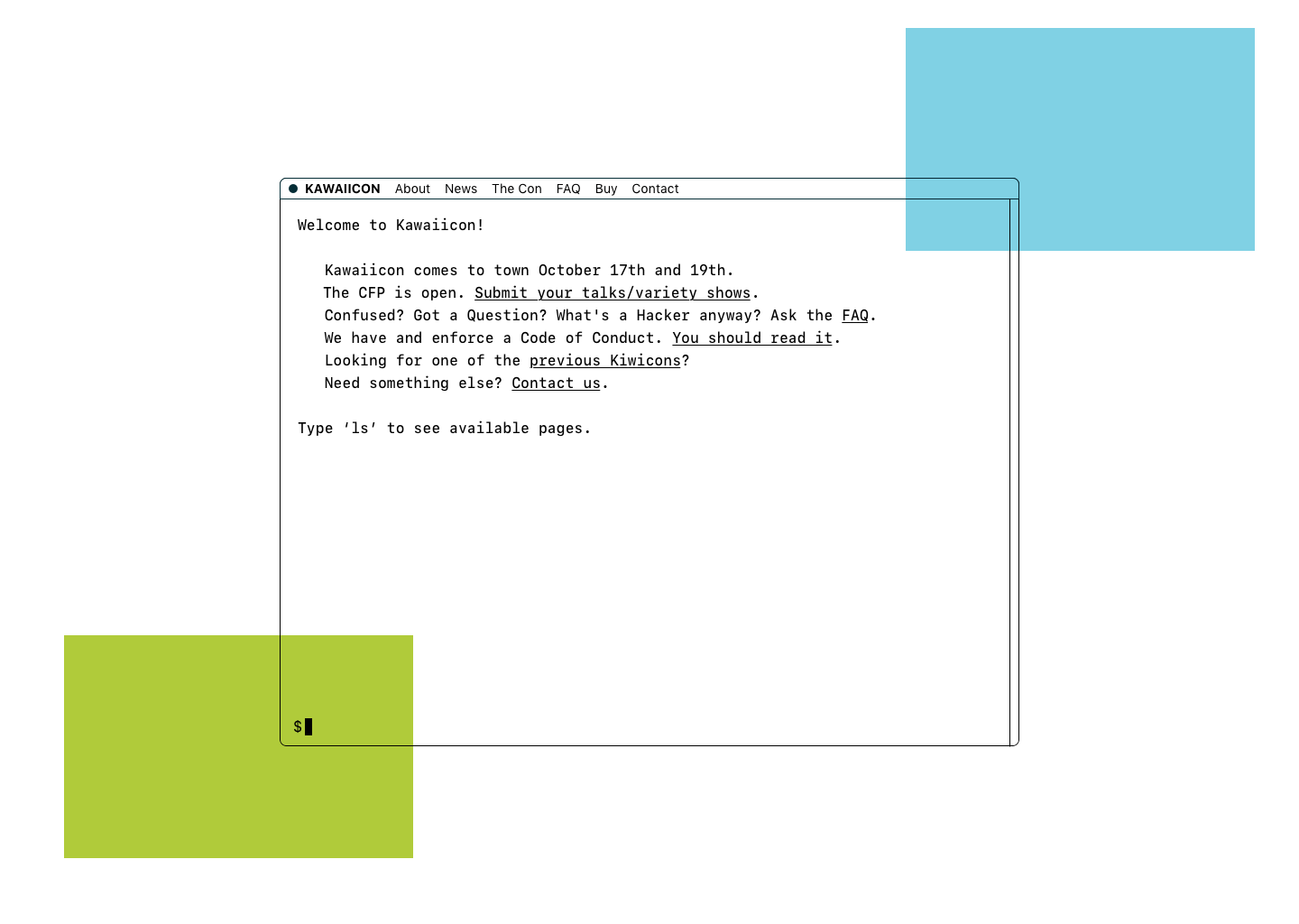
For Kawaiicon, the Crüe were looking for a fine balance between cute and serious. They wanted a look that would elicit both "aww"s and respect from the hacker community. A style that was unabashedly cute, while unquestionably hackeresque. Colours that were soft, but not pastel.
To achieve this, I suggested going with a hypercard/manga aesthetic — a high-contrast, mostly black-and-white colour palette with pops of colour here and there. White boxes with black borders were reminiscint of both manga panels, and hypercard windows.
This would balance the cute/but-still-formidable vibe nicely combining visual nods to the carefree expressiveness of manga, and the old-school computer nerdiness of hypercard.
Some inital sketches:
The coloured boxes are to indicate where artwork will go.
Implementation
In my opinion, most websites on the internet don't need to be fully-fledged web applications, and conference sits are no exception. I therefore made Kawaiicon's website as a static Jekyll site.
Some things that I really enjoyed working on with this website were:
- The sparkly cursor trails ✨
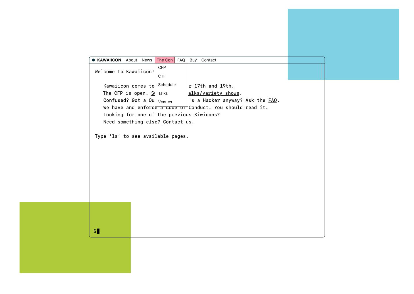
- The main navigation menu, which is a responsive dropdown menu that I made with only HTML and CSS. No javascript needed!
- A schedule that is accessable offline (common around hacker cons) and allows jumping to the current event for ease of use.
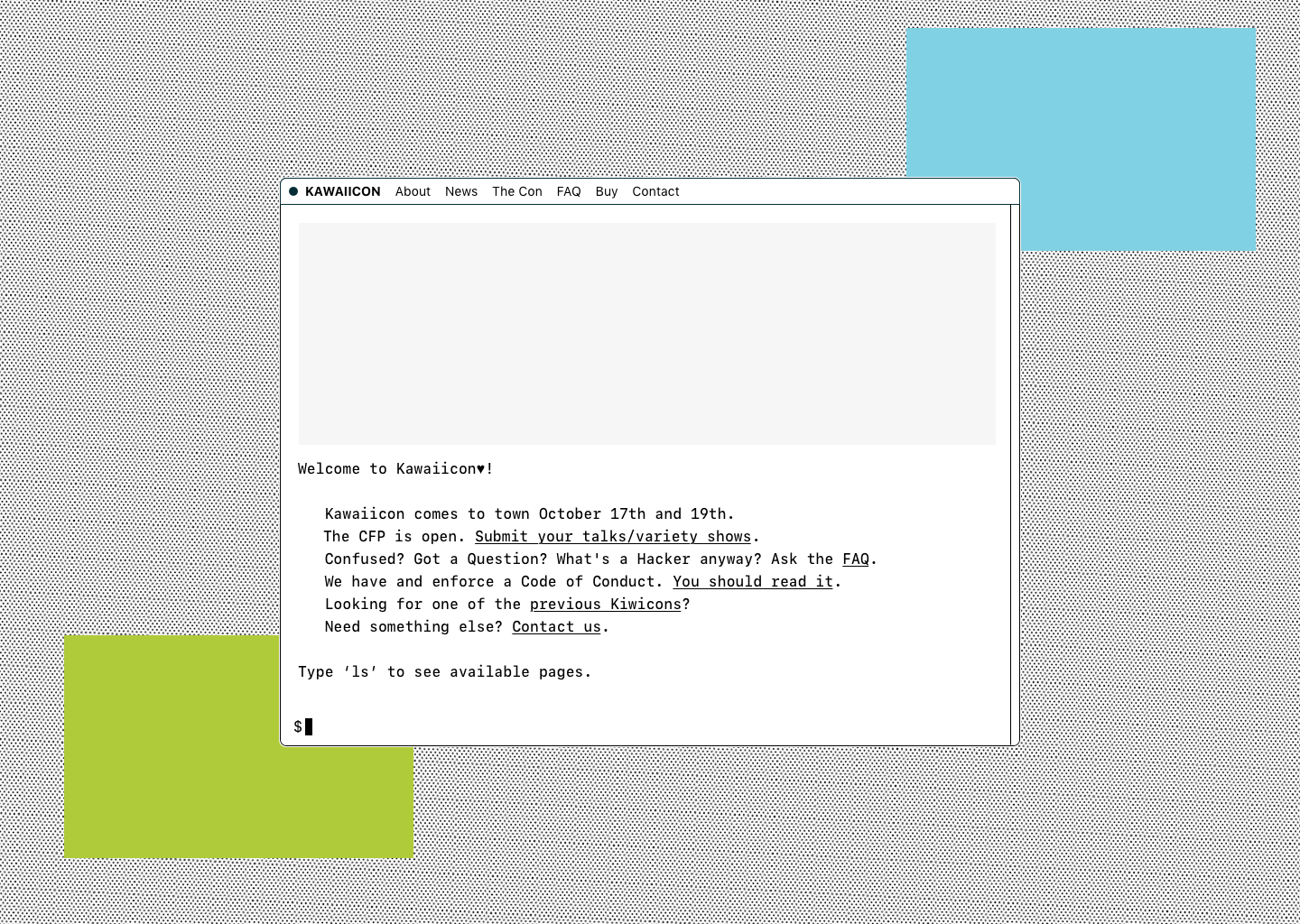
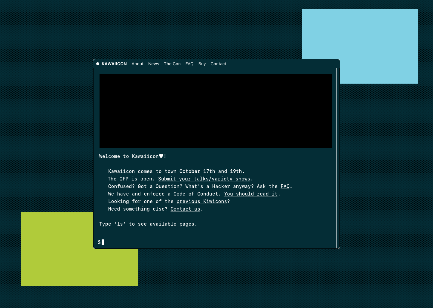
The final product: