Web UI Toolkit
Building UI at lightspeed
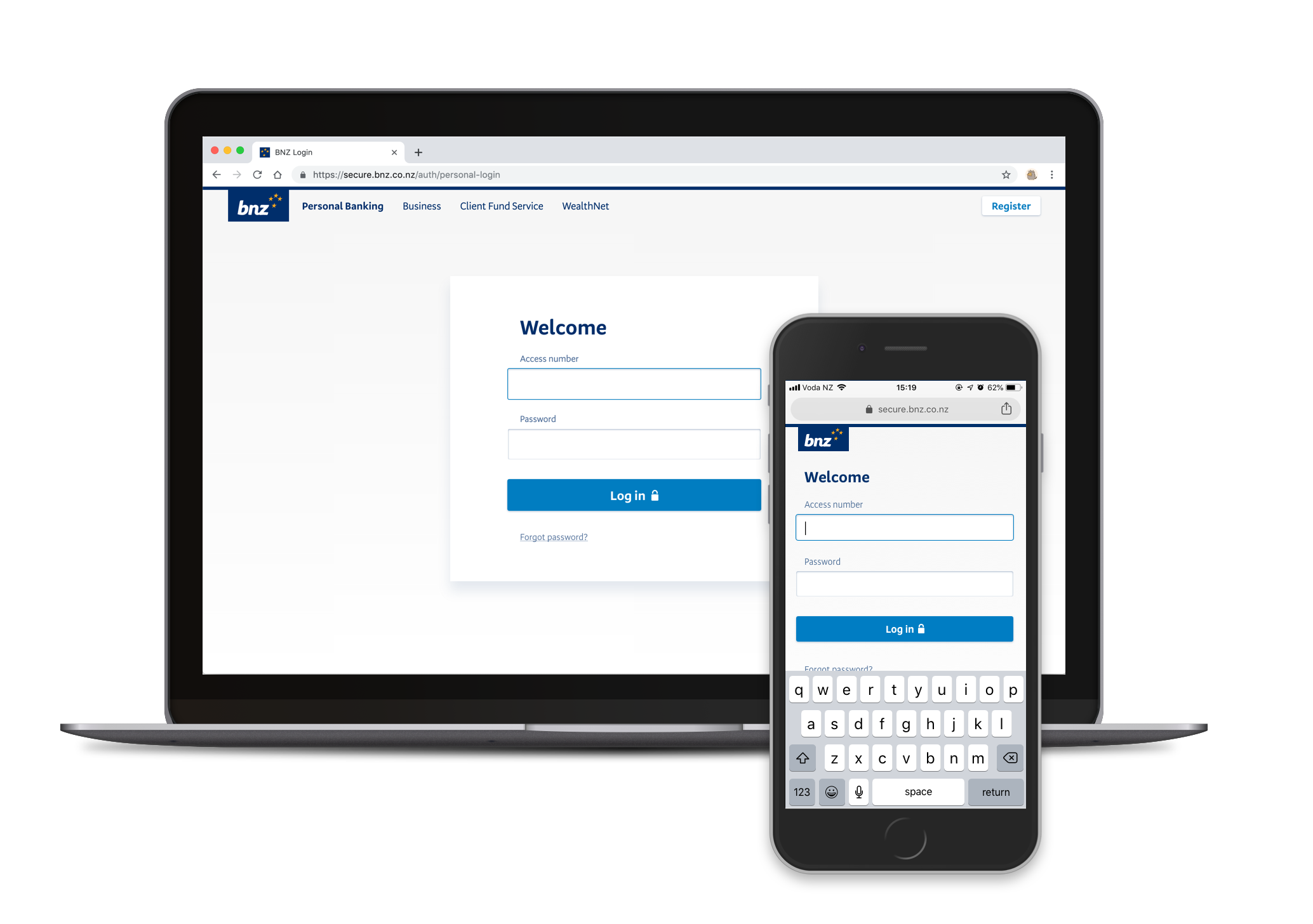
Aug 2016 – Dec 2018In 2015, a small but rapidly-growing digital department within the Bank of New Zealand was facing the timeless challenge of maintaining code and design consistency. We were building and supporting two web applications, four mobile applications and dozens of websites — all with vastly different codebases and design patterns.
I drove and designed for a "styleguide" initiative that included the Web UI Toolkit. By 2019, the Web UI Toolkit is in every major application we have, including some third party ones.
This is the story of building useful tooling at scale.
The challenge
Flexible consistency
BNZ Digital was plagued with the age-old and inescapable curse of technical debt and inconsistencies.
The purpose of the styleguide initiative was to:
- Free up mental resource from designers and developers to keep them away form menial, repetitive tasks (such as building Yet Another Button, or asking around the office for a certain Sketch file).
- Encourage design and code style consistency, while being robust and flexible enough to cater to our large and diverse customer base.
- Speed up the onboarding process for new designers and developers.
The solution
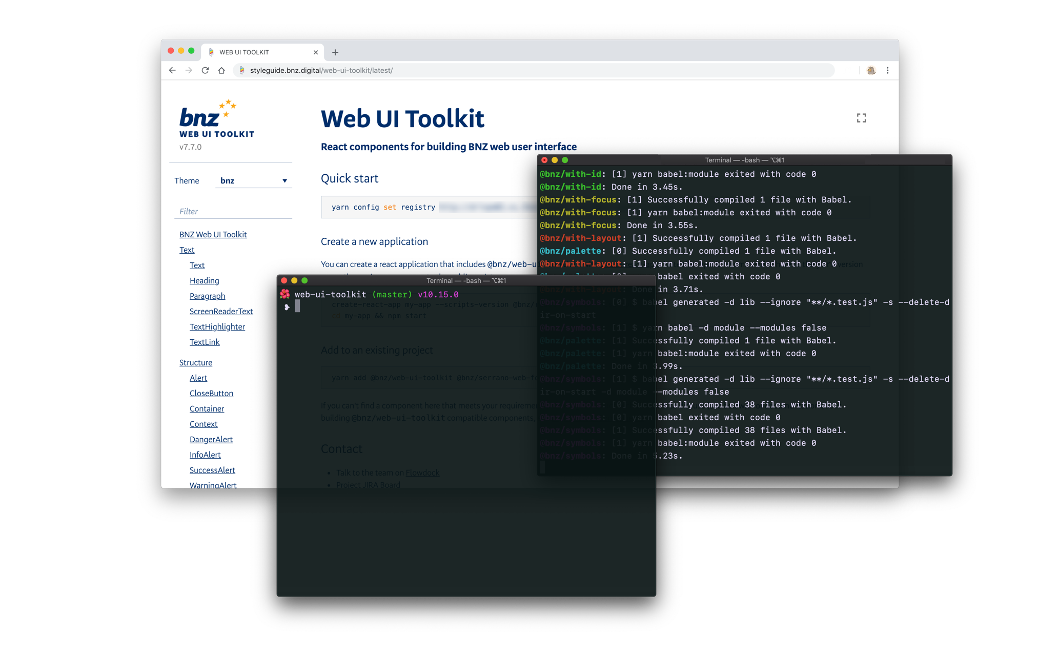
We built a functional, stateless React UI component library for developers across all platforms to consume. We also introduced a considered approach towards building, contributing to, organising, and consuming internal npm modules.
My role
I was the primary designer on the styleguide team. Our team was small and nimble, consisting of a designer (me), two developers, a tester, a product owner and a business analyst.
I worked closely with the design team to ensure that the kit we were building would be fit for their purposes, and with our delivery teams to make sure that our toolkit would actually make their lives easier.
On this project I had the great privilege of working with some of the best developers in my career so far. There's an indescribable joy that comes with working with people who are so good at what they do, they push you to become better at what you do. This has been my favourite project to date.
Results
Since this UI library was built outside of any one platform, our most important metric was how much our toolkit was being consumed across all BNZ Digital web platforms. After all, this toolkit is made to be useful, so it had better be used.
After committing our first line of code in September 2016, we released v1.0.0 in March 2017. We were integrated into our Internet Banking platform two months later, and then the main website and Internet Banking for Business four months after that. The Web UI Toolkit has also been consumed by staff-facing platforms outside of BNZ Digital, and third-party applications outside of BNZ. The impact of this initiative is discussed further at the end of this case study.
Research
These days it seems like there are a million different approaches to styleguides, and just as many Medium thinkpieces. Before setting out on pitching this initiative to senior leaders at BNZ Digital, I dug wide and deep into the literature and learnings on styleguides throughout the internet, to learn from those who had gone through the journey already. I read in-depth case studies from Lonely Planet, Seek, Salesforce, Mailchimp, 18F, A List Apart, GOV.UK, Shopify, Westpac GEL, and Uber. From this reading I made notes of common pitfalls, mistakes, and key patterns for success.
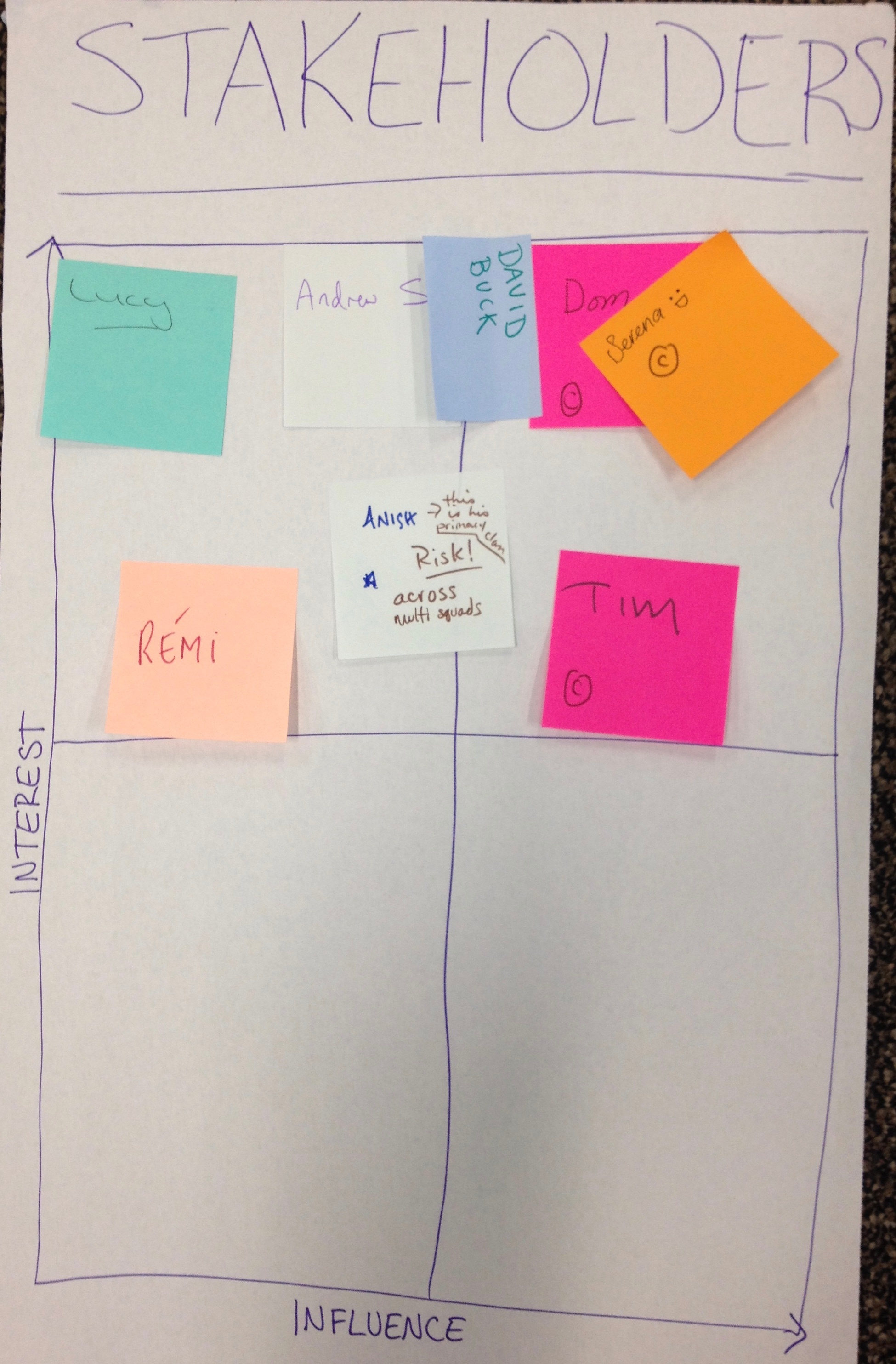
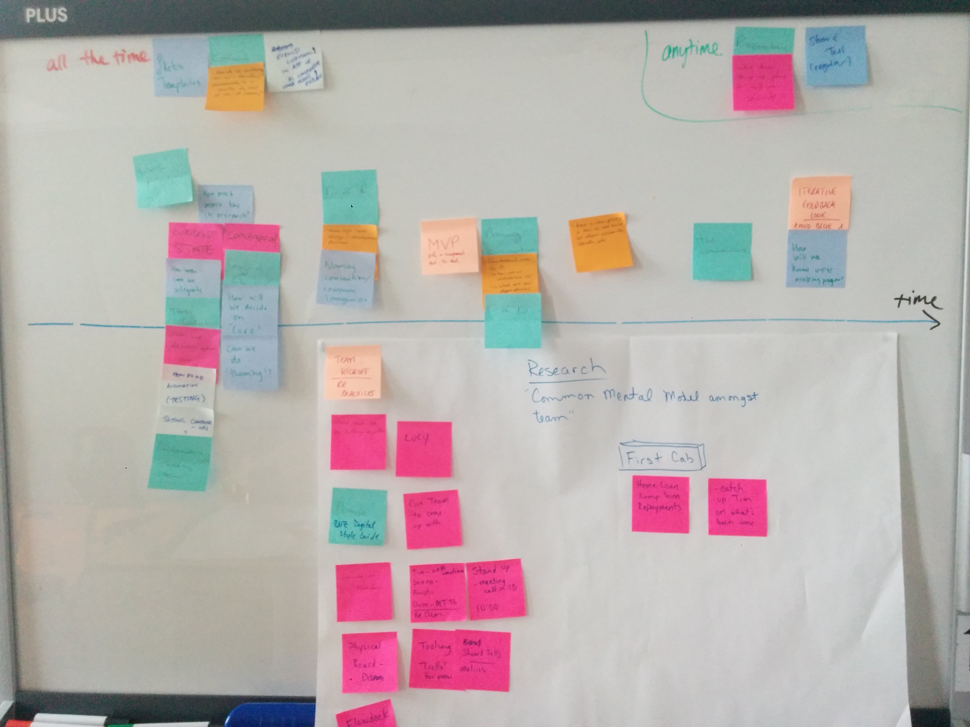
I wanted this initiative to be genuinely useful, and significantly improve the lives of the people around the office. Along with my team, we drew up a Stakeholders map, which included a) people who would directly be using the styleguide (designers, content writers, product owners, etc), b) people who would be building out the styleguide (designers, developers, testers), and c) the big wigs, who will need to see value come out of this initiative (Head of Digital, Head of Design, etc).
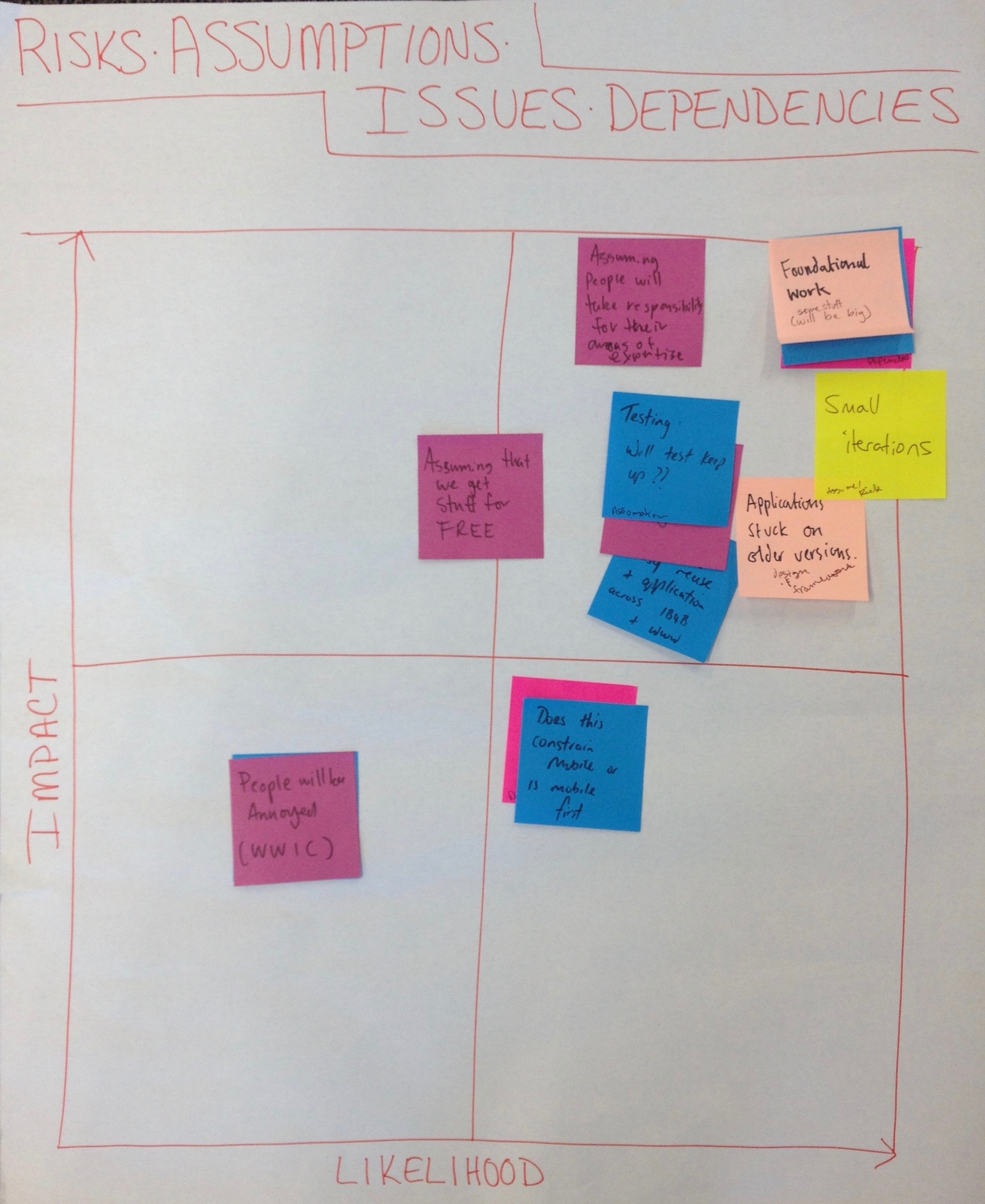
We also mapped out our risks, assumptions, issues and dependencies. From these exercises, I set out to conduct some informal research interviews with our three stakeholder groups. It was important to me that these were informal, as I didn't want those interviewed to go into "solution mode". I wanted them to reveal to me their genuine problems and pain points. I embedded myself into the weekly front end get-togethers, and listened closely to our engineering managers' lamentations. Here are some notable things that I learned:
- There was a great amount of risk aversion towards large-scale refactoring pieces of work. The teams had just gone through a year-long migration project, and were itching to deliver new things. Whatever we made, it had to iterative in nature.
- There is often a disconnect between design and development. While developers would like to build consistently, often it is the designs themselves that are not consistent, and since their work is tested against the designs, often they will just build the bespoke thing. There wasn't a good way to push back on design.
- Developers wanted to be included and involved in any large-scale refactoring or component-library building.
- However, our developers were incredibly busy, and often didn't have time to weigh in on every decision. For this toolkit to be successful, we will need to balance out external contribution with speed.
The pitch

The term "styleguide" encompasses a messy swarm of definitions. To clarify our intentions, I proposed a four-fold approach: two documentation pieces and two resource pieces, one of each for design and development.
Our developers were already informally following AirBnB's JavaScript styleguide, so that was one part of the quadrant sorted. For the other three, we (the "Styleguide team") wrote out all the things we wanted to accomplish, and mapped them out on a timeline to prioritise our tasks.
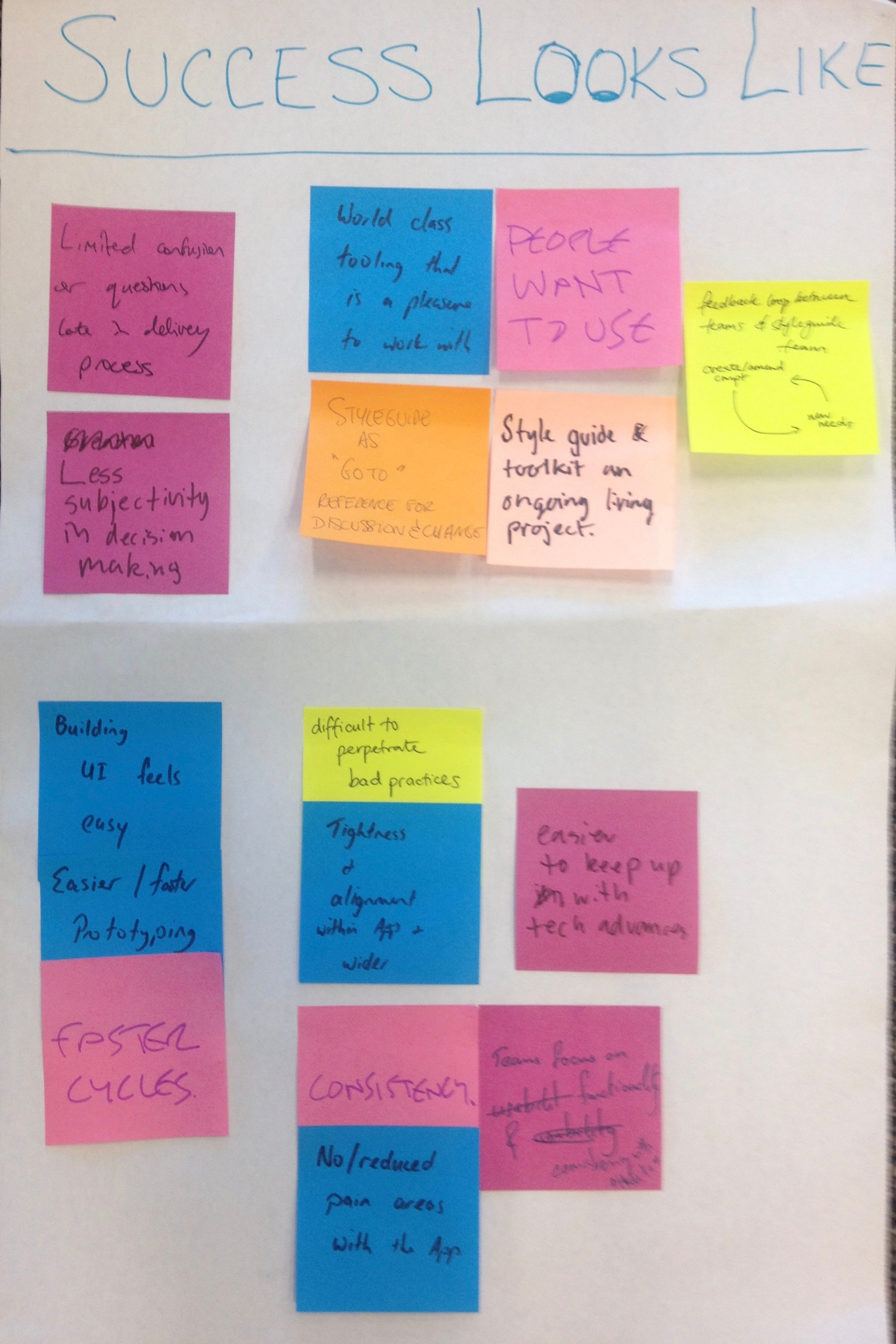
We agreed on our measures for success:
The Styleguide initiative can be organised like the sketch below. To start out, we focused on design documentation, a web UI framework (which is what this case study is about), and an asset library.

Prerequisites
First thing's first: getting a land of the land. This was the uninteresting grunt work. I went around the design team and collected as many recent artifacts as I could. I also audited our web applications and noted all the UI pieces.
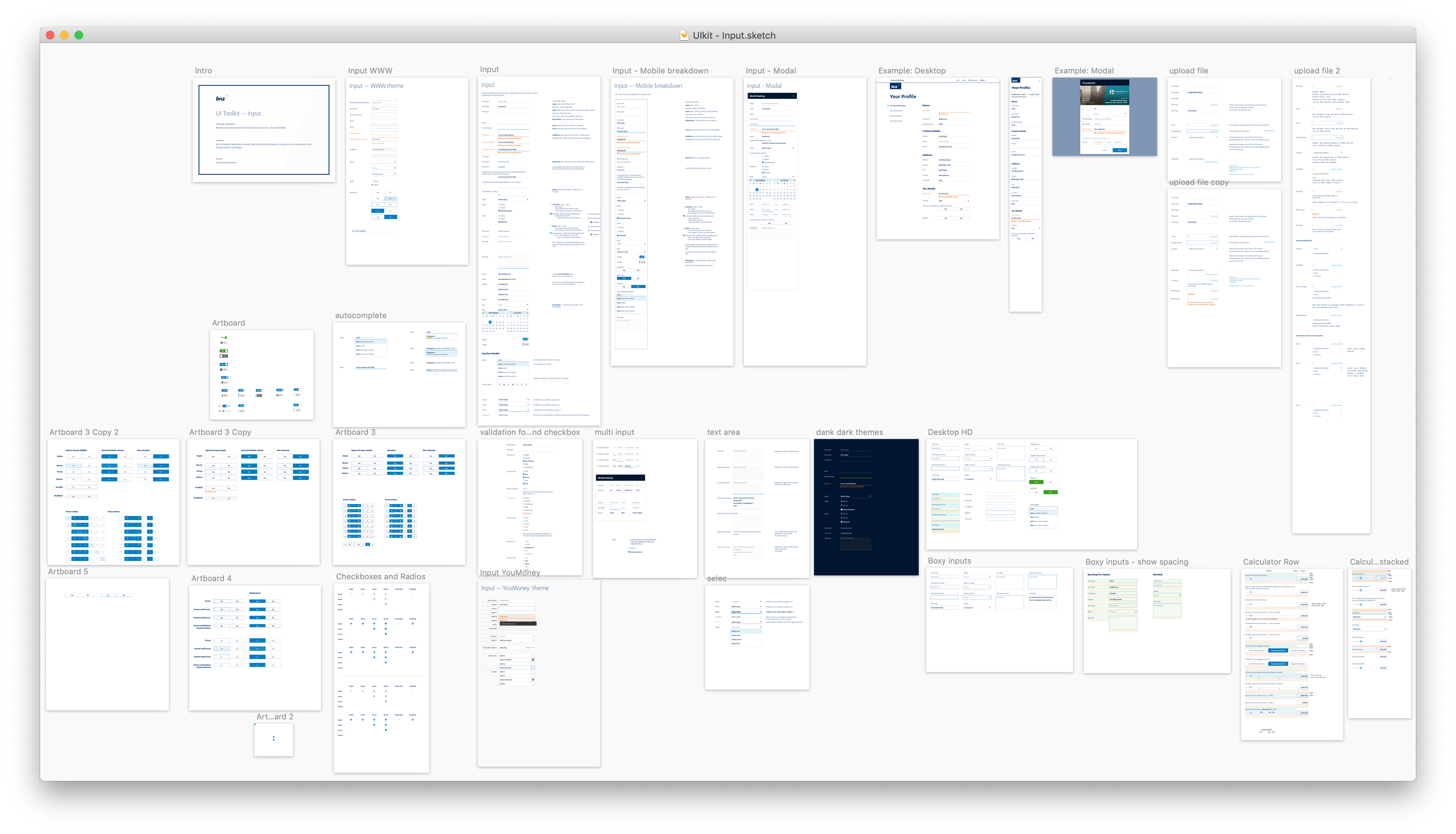
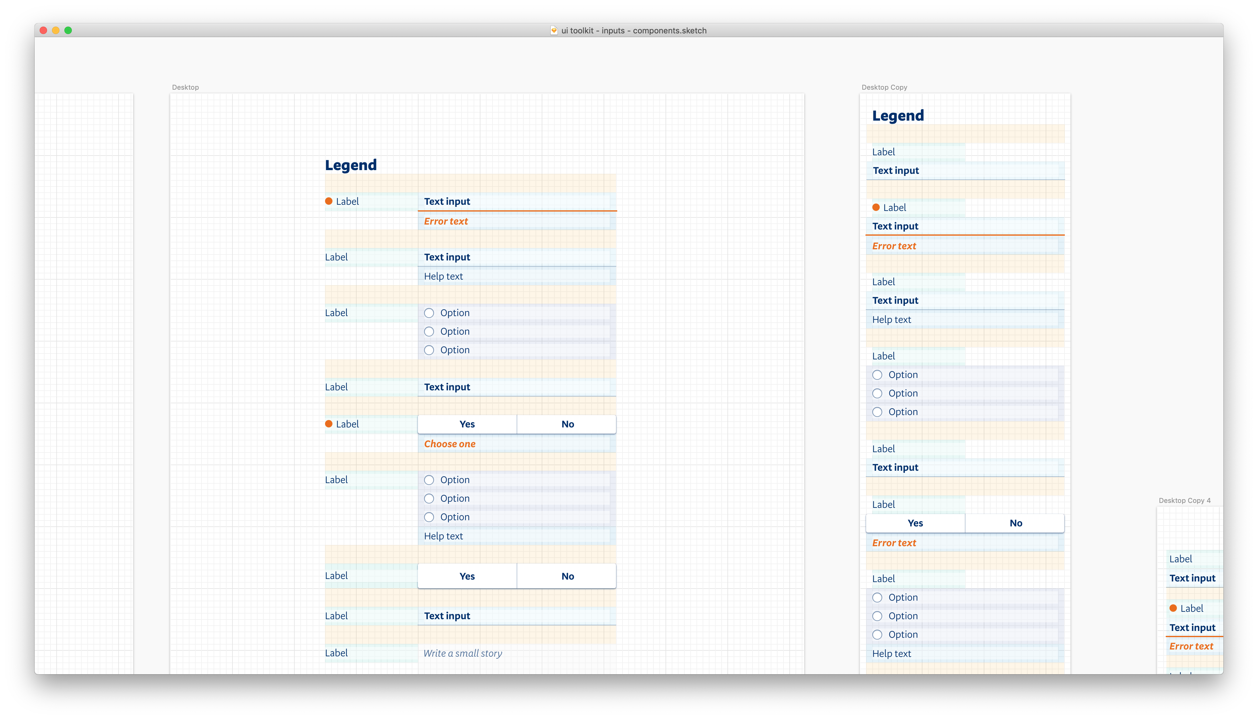
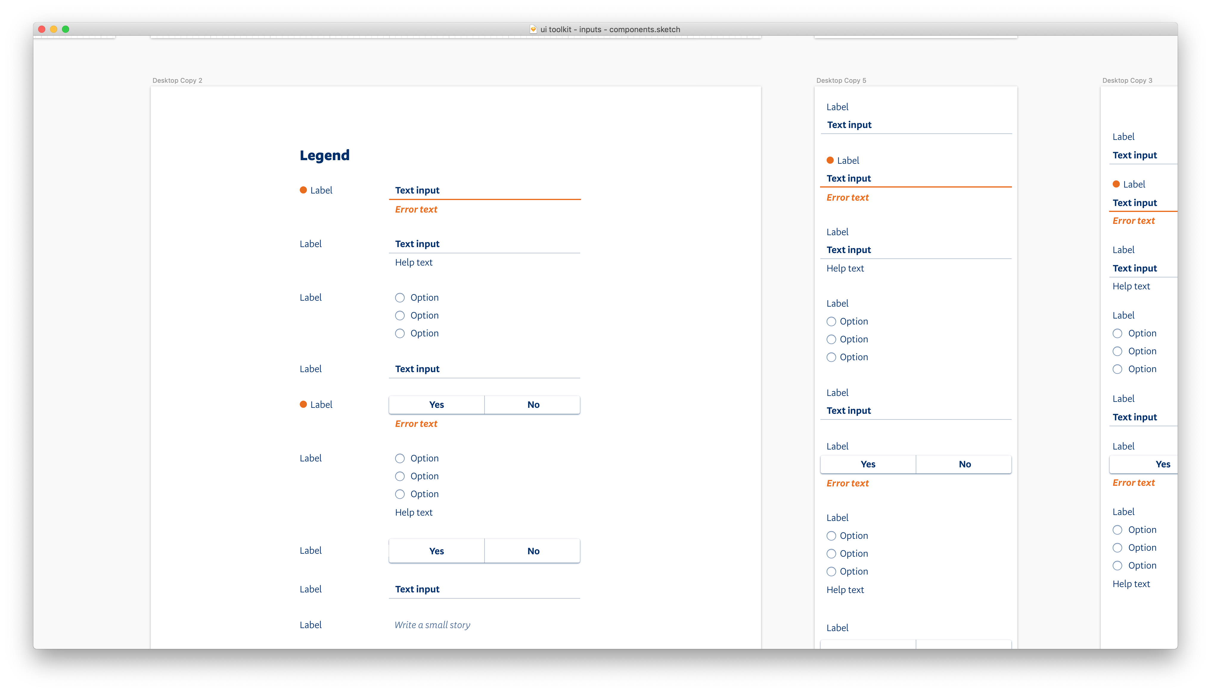
From there I categorised all the elements into function type (for example, buttons, inputs, typography styles, navigation, etc). Then, I merged similar UI elements where appropriate, tidied up the designs, and released the cleaned up versions to the design team through a drag-and-drop, versioned and synced Sketch library.
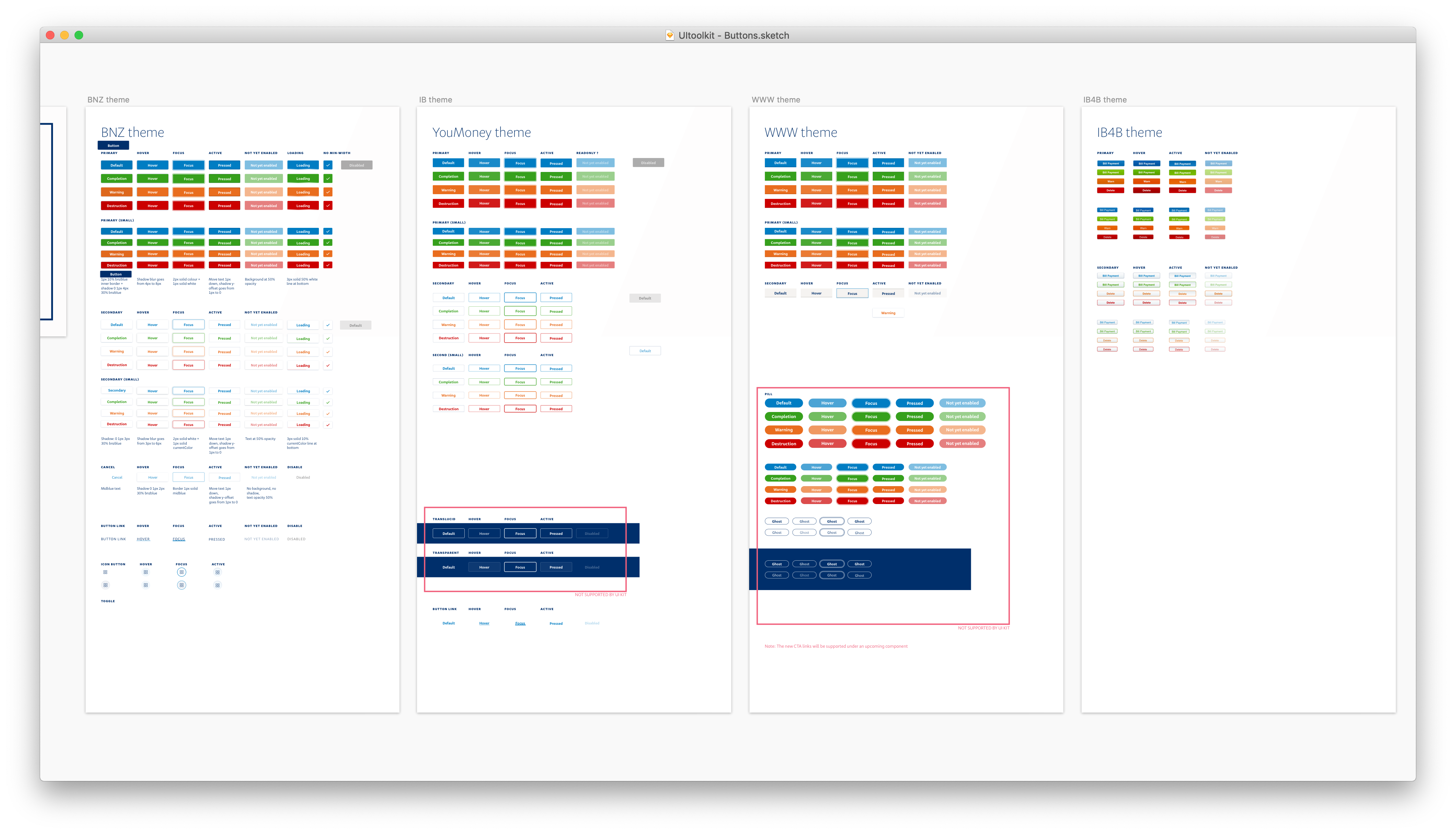
Back with the Styleguide team, I sorted the (many) variations of different basic UI components into distinct themes, and tidied up the designs so that all styles were internally consistent.
Uptake over (global) consistency
A "perfect" toolkit that no one uses is a PR piece and not a toolkit at all. We opted to prioritise uptake over consistency, all while keeping the path to consistency clear and easy.
To do this we introduced theming. At the time of inception, the look and feel for our three main web channels were completely different, and introducing a fourth, new design would cause even more fragmentation (not to mention a bad user experience). To mitigate this, we produced themed versions of UI components, so that they may be stealthily used within our current web applications without looking jarring to the end user.
It's also important that our toolkit anticipates the inevitability of future redesigns. Theming handles applications in transition modes gracefully, and also allows us to introduce consistent interaction patterns (which takes longer for users to learn) before we introduce consistent visual patterns.
As for the technical side of things, we opted for a stateless, functional plug-and-play React components (inspired by rebass by Brent Jackson) for our UI kit.
Developer UX
For this to be a success, the developer experience had be easy, intuitive. We wanted to be known as enablers, not the UI police. This meant dedicating a significant amount of time to developer relations: sitting down with them, and understanding what they needed.

All the different projects we embarked on for better developer experience could warrant their own case study, so I shall simply summarise some of the projects here. In short, we
- Broke reusable functions down into their own npm modules for easy widespread use (things like our palette, typography, etc).
- Introduced higher-order components to make integration and upgrade paths smoother between
web-ui-toolkitand non-web-ui-toolkitcomponents. - Created our own version of
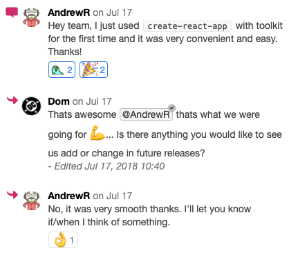
create-react-appso that developers could quickly test components and get more comfortable with using the Web UI Toolkit. - Ran biannual demos for the development community within BNZ Digital. This acts as another channel to field questions and communicate (different people prefer to communicate in different formats!).
- Made sure to discuss all decisions in an open chat channel where anyone could view and join the discussion.
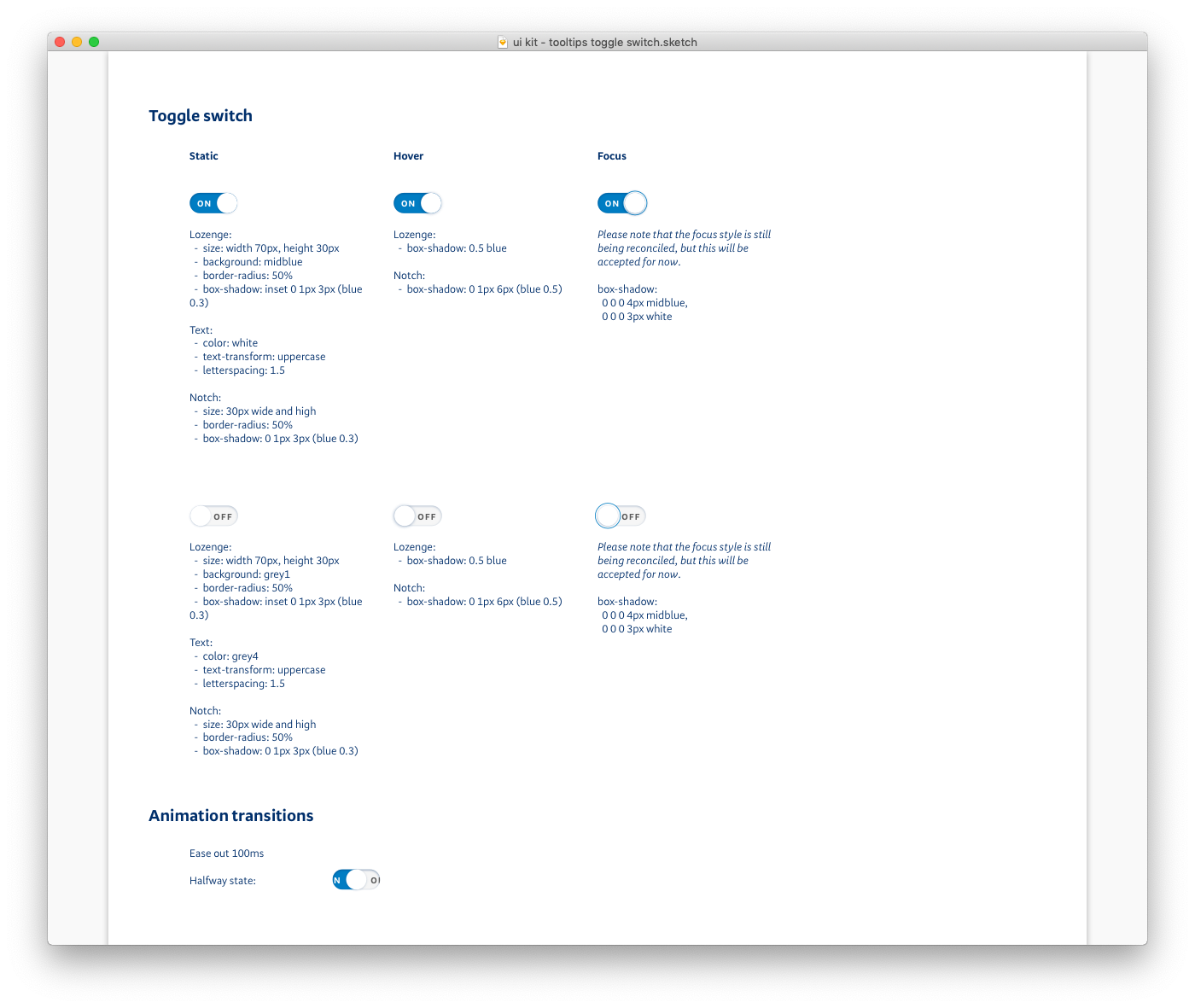
Pixel perfection
Though the visual design was the last part of the design process, the level of finesse required for the toolkit was even more important. The toolkit's only job was to render UI, so that UI better be perfect.
To ensure this, I worked closely with the rest of the design team when sketching and finalising the visual designs for UI. Just as the developers needed to trust that the toolkit would render the right code, the design team needed to trust that the toolkit could cater to their various needs. The trick was to balance robustness in our designs (so that all needs were met) with consistency.
I wish I could say that there was some secret sauce to this, but there really isn't. One has to do the work with sitting down with colleagues, walking through their design problems with them and really understanding what they need — what their constrains were, and discuss how our decisions would affect the overall end user experience.
Maintaining momentum
So far we've had pretty good feedback from developers, and we're continuously integrating their comments and suggestions.
A styleguide is never finished, never fully set in stone. As designers and developers learn and improve, the styleguide and Web UI Toolkit morphs and moves with them.
The Web UI Toolkit team now has a secondment programme, where developers can join the core team for two weeks at a time, building either something for their own delivery team inside the Web UI Toolkit, or something on our backlog, or something else entirely. From these secondments we learn more about the features and pain points of our own toolkit, and they naturally tend to become an ambassador of the toolkit throughout the process.
Retrospective
I learned that
- The importance of building processes and a community around the toolkit far outweighed the technical decisions.
- One needs to stay laser-focused on the purpose of the initiative. It's easy, especially with a large and far-reaching project such as this, to get sidetracked with shiny, competing interests.
- Imperfect implementations were acceptable to allow for uptake. The toolkit being in every channel has enabled unprecedented speed in development. A toolkit that no one uses is wasted effort.
If I had six more months, I would
- Work more closely with the teams building applications for our business customers. These teams operate on a significantly different (and much older) stack and were not being catered to as well as other teams on more modern tech stacks.
- Collaborate with our mobile designer and mobile teams to execute a similar idea in our native apps: first separating presentational code from app logic, and forming a rigorous UI library from that.
- Combine the
web-ui-toolkitand the Sketch component library for designers. A dev and I had a few goes at this, but the idea was deprioritised by our product owner (a fair decision). However, as time goes on, the risk that we run into is that the toolkit and design assets become out-of-sync with each other, causing confusion as to which source is the source of truth. There are some really cool React component integrations with Framer X, which a fellow design team member has recently picked up. I'm excited!
If I had a time machine, I would
- Give up on working on the project "in my spare time" and pitch to stakeholders sooner. An foundational initiative such as this that touches on every facet of the department requires real investment. It wasn't until we got the green light to form a full-time team did things finally start sticking.
Impact
Two years after its first conception, we have a lightning-speed React UI library, a drag-and-drop asset library in Sketch, and a continually expanding styleguide. The impacts of this initiative, however, were much wider and more significant than simple outputs.
Our team's dedication to such a high degree of code and design quality for the UI layer inspired similar calls for quality elsewhere. We pioneered processes and ways of working that are now the gold standard at BNZ Digital: releasing on demand, remote-first (for greater transparency, even though most of our team were in the office), engaging in weekly dev community get-togethers, and developing a culture of sharing. When this initiative started, we were on fortnightly and monthly release buses. Now, the majority of our channels release on demand, often several times a week.
On top of that, our practices and patterns were recognised by the Chief Architect at Bank of New Zealand's parent company, National Australia Bank, and the teams there are looking to implement the ways of working that we've developed with this initiative at their company.
As of today, the Web UI Toolkit is being consumed in all of our major applications, our website, and even a few third-party sites. It has fundamentally changed how our teams work, encouraging all of us to consider the flow-on effects of each code and design decision. ■