Authentication App
Log in, log out
Jan 2018 – April 2018BNZ services a large handful of different customer-facing web applications — all with different authentication flows.
With the advent of open banking coming to New Zealand, we needed to build robust authentication services that could handle things like OAuth flows. This presented us with an opportunity to reconcile the designs for our disparate authentication screens, and create one login flow to rule them all.
Since a login flow is rather standard, this case study focuses on how I approach visual refinement and interface design.
The challenge
One flow to rule them all
At the time we had different authentication flows for different web applications, even though our customers saw everything under the same "BNZ" banner. Customers who used more than one app would have to log out and back in — an annoying and tedious experience. This was first step towards a single-sign-on experience.
In some other places, like the website, you could not even log in at all. This meant that we had an ever-increasing number of forms that try to redirect people to authenticated channels, with varying success. Laying the groundwork for single-sign-on meant we could meet our customers where they were, instead of making them jump through hoops.
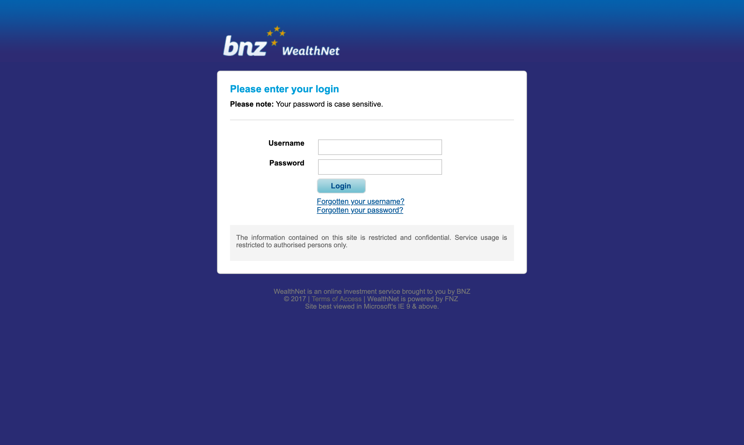
Under the hood, our authentication system at the time was old and outdated — legacy systems that cut off any passwords longer than 8 characters (yikes!!). As a part of our upgrade, we wanted to also encourage our customers to update their passwords, and educate them on good password hygiene along the way.
The solution
We ripped out old legacy authentication databases and systems and built a new, platform-agnostic authentication app. We slowly migrated customers off the old systems in the background, and encouraged customers to update their passwords once they had been migrated.
My role
I was the primary designer for this project, working with both the core Web UI Toolkit team (who built the front and backend of the app) and a Digital Engineering team (who built the infrastructure). I also worked closely with our UX Research teams during the testing phases of this project.
After our release, I collaborated with fellow designers Bryce Howard and Anton Di Leva, who worked on introducing mobile 2FA to our login flows.
Results
By the end of April 2018 we migrated a total of around 50,000 customers off the old technology. Within the first month, around a quarter of our customers voluntarily updated their old passwords (our new systems allow passwords of up to 60 characters, include special characters).
Research
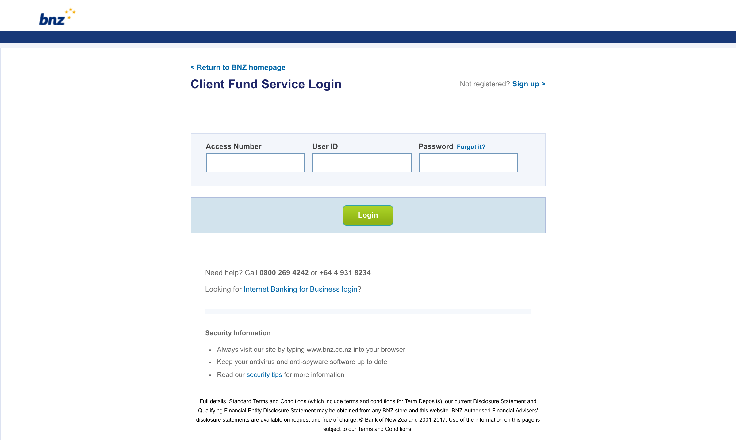
First, I needed to confirm my assumption about the universality of login pages. A quick survey of login pages on the internet showed a consistent pattern: two input fields, followed by a button. Some had extra options, such as signing in with another account, while others filled the space with nice illustrations or photography. Some included extra navigational elements. Other than that, it seems like all the login screens on the internet follow a solid pattern. This ubiquity is something we can leverage.
Heads down, designs up
Given my driving assumptions around users and their familiarity with authentication flows, I started churning out the pixels. Usually I would wireframe out user flows, but given the ubiquity of login flows and our limited time budget, I opted to focus my time on the visual treatment of the screens.
I wanted to keep the style as simple as possible, with the focus being on the form itself.
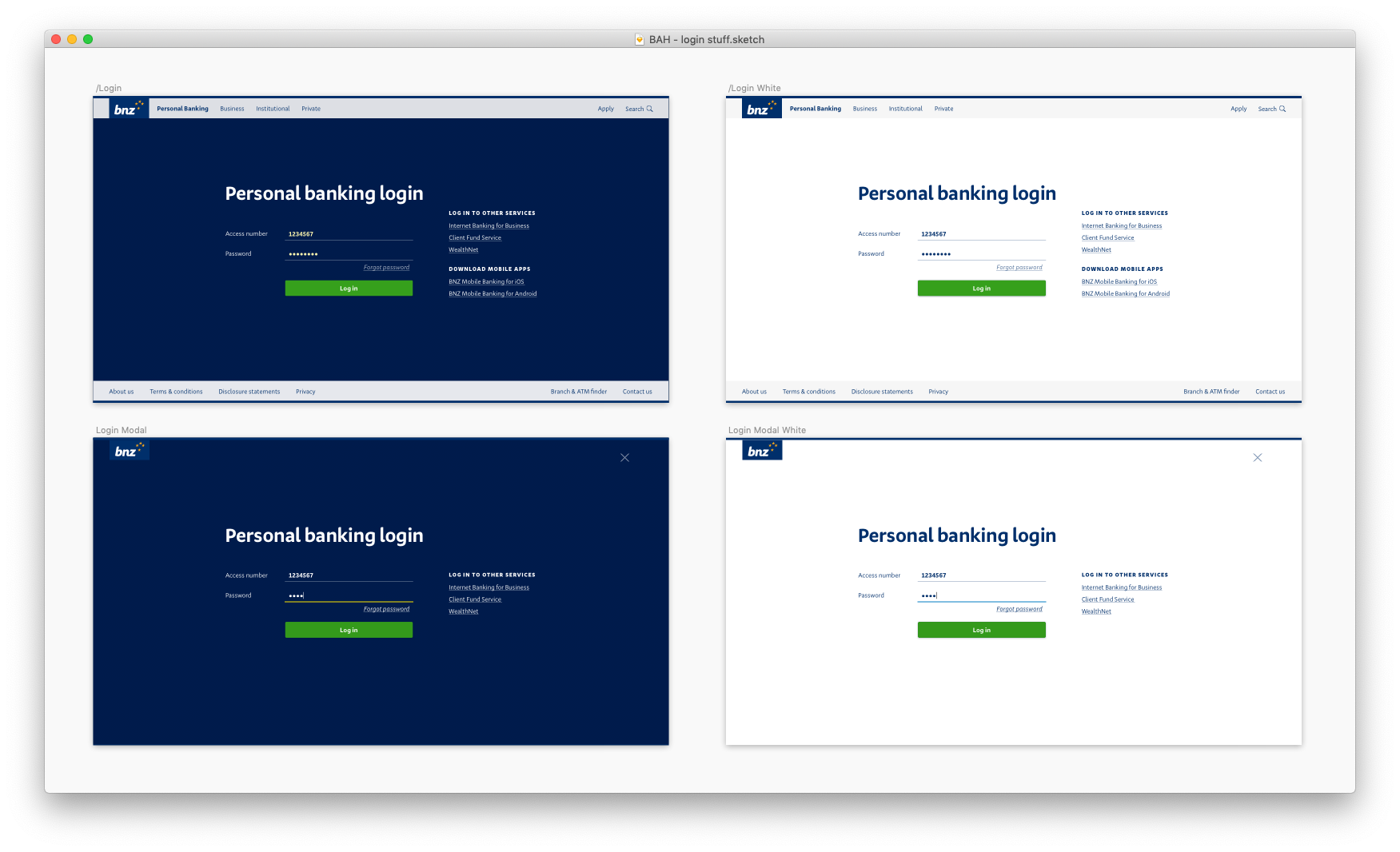
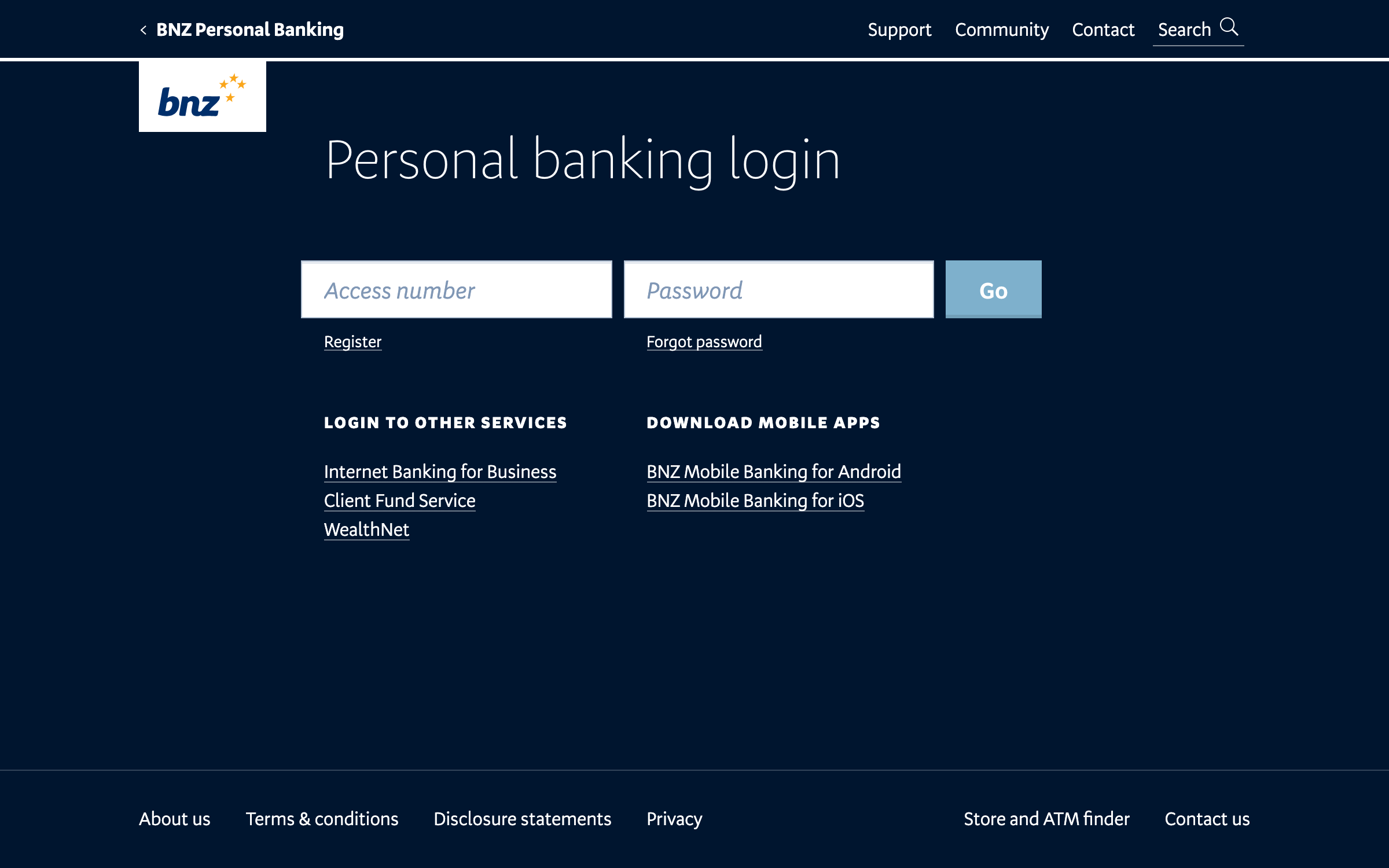
My first attempt was visually close to the current login screens at the time. This was an alright start, but immediately there were things that were problematic.
- So much navigation. Too much! Do we really not trust our users to be in the right place? Surely not all of the links are equally helpful.
- Our underline input style in the UI kit worked well for long forms, but really stood out as a potential problem here. Inputs should look like inputs, without anyone giving it a second thought.
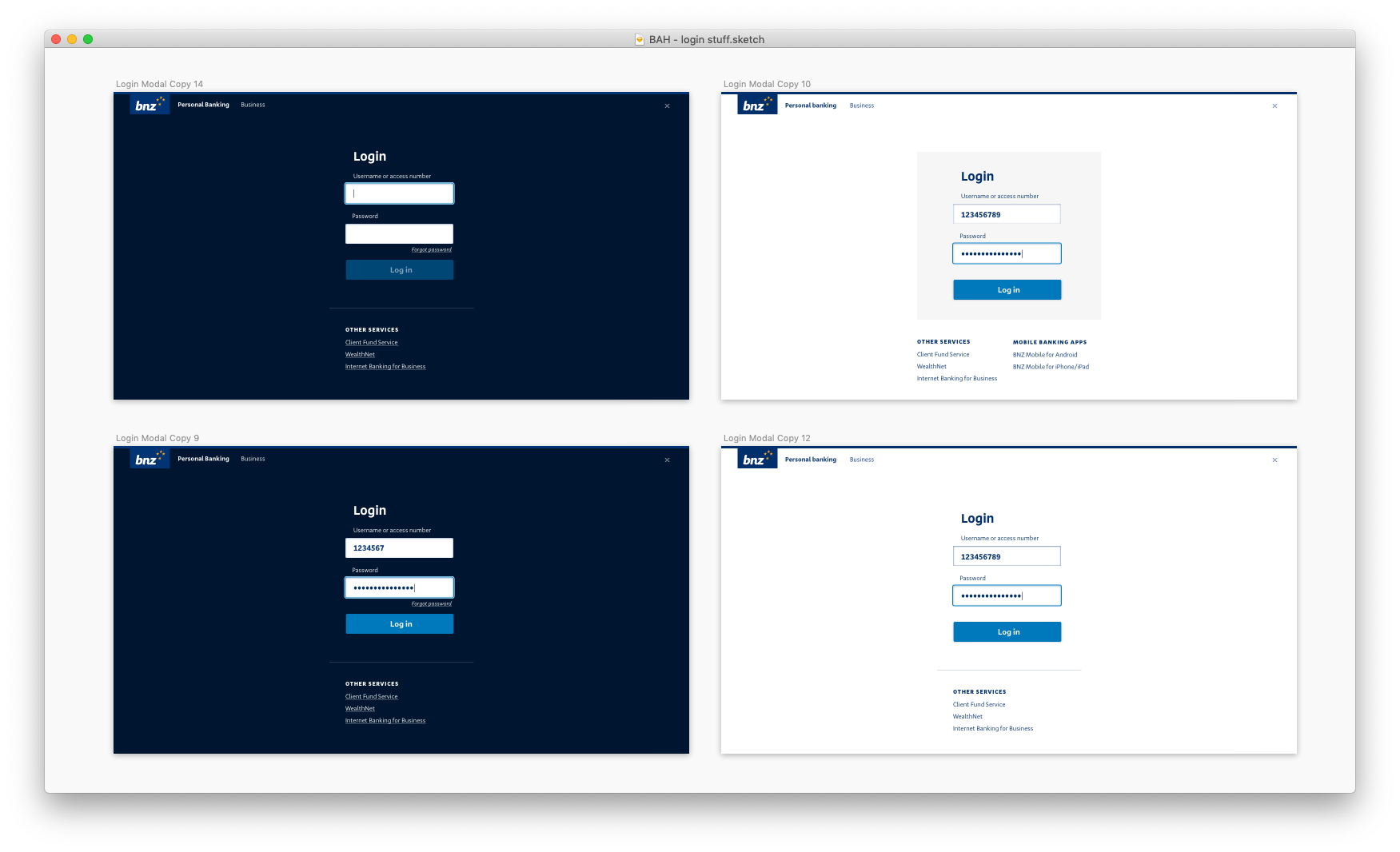
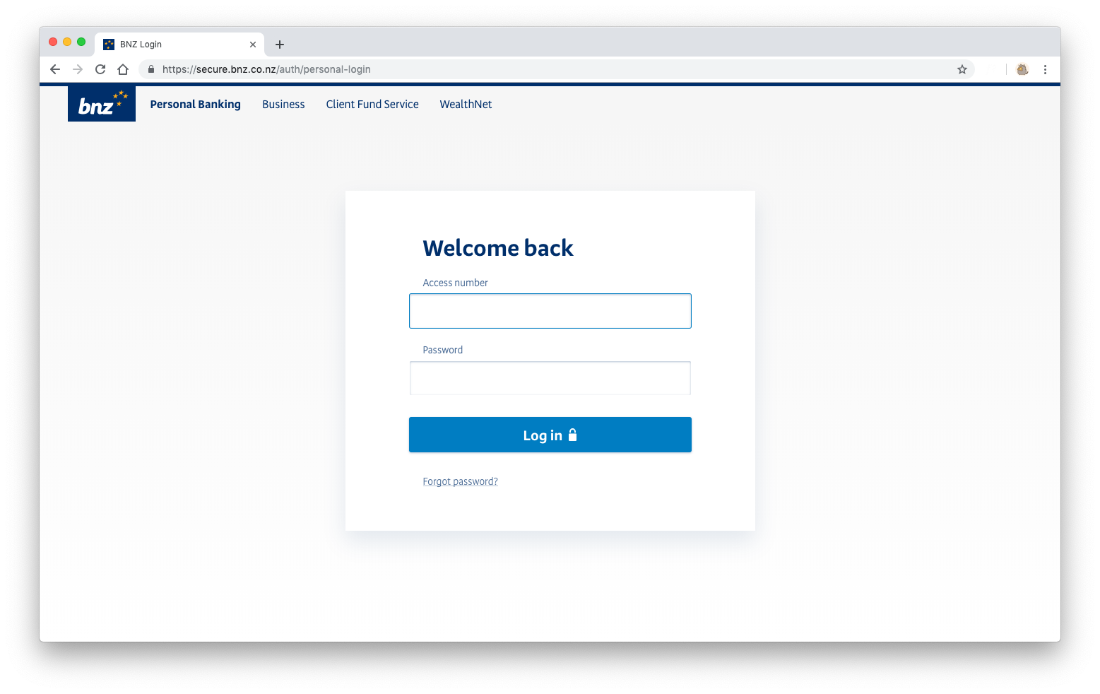
I cleaned up the navigation and moved the page to a single-column layout to make it as easy as possible for the eye to parse. I also introduced a "boxed" input version.
As Don Norman talks about in The Design of Everyday Things, objects have affordances — visual, audible, textural clues that tell someone how it should be used. This applies to digital interfaces: when someone sees a box with a label, it tells them the box is something they can type in.
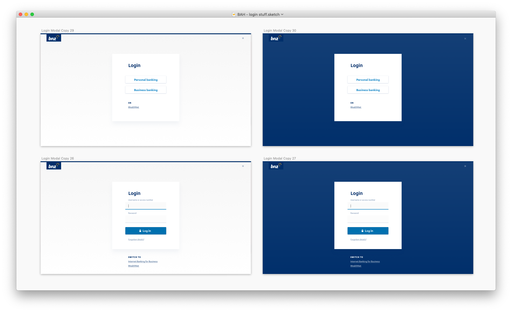
Though the navigation has been pared back, there is some logical inconsistency around the Personal/Business login switcher at the top, and the links to other login pages at the bottom.
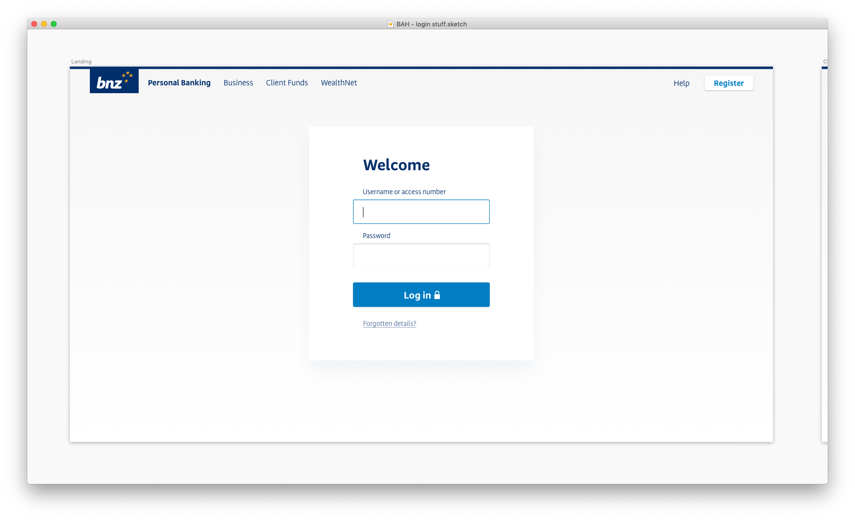
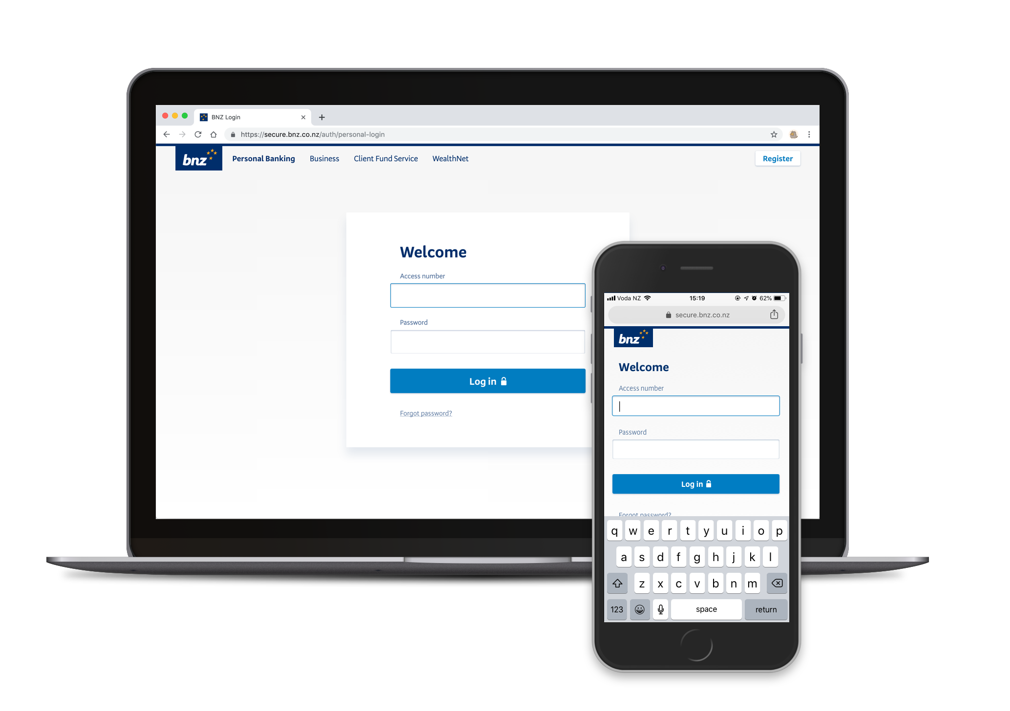
Now we're getting somewhere. The navigation is logically consistent, the inputs look like inputs and the subtle drop shadow around the form brings focus without distraction. Apart from the SVG logo and the SVG lock icon, there are no image assets to slow down load times. Moreover, the logo, navigation bar, inputs, buttons and text styles are already built in our Web UI Toolkit, which means the front-end of this should be a breeze to build.
But does it scale?
Now it's time to put this design to the test: is it robust enough to handle different authentication flows? How will it handle validation errors, server-side errors? If the content team need to display an urgent alert, what will that look like? And let's not forget about mobile and tablet viewports.
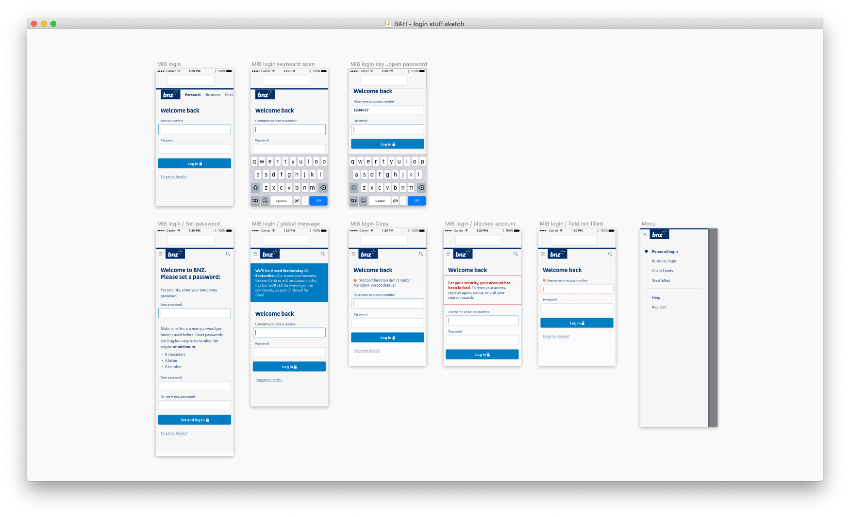
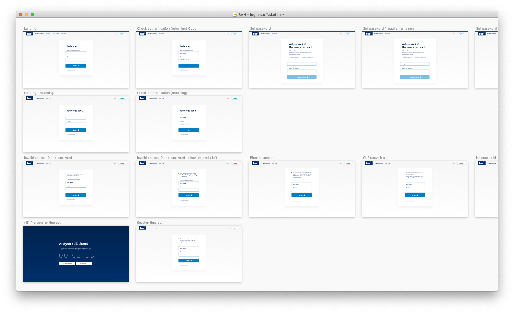
To make sure I didn't miss anything, I obtained a list of all possible errors that could occur, and the reasons for why it would occur, how we would detect it, and what the best course of action the customer should take from there. Then, I worked closely with one of our content leads to construct informative and helpful UI messages.
You'll notice that I designed for features that were not going to be in our first release. This was to make sure that the style I had gone with for our login page would suit a variety of authentication-related flows in the future.
User testing
After 'shopping the designs through our design team for feedback, it was time to put the new screens to the test. For our first release we wanted confirm or deny the following assumptions:
- It was clear what had to be done to log in
- Business customers could switch to the business login
- Users understood all user-caused error messages and server-side error messages
We also were curious to find out how jarring these new designs would be, and if customers would suspect a phishing attack was taking place. The old login screens had a dark blue background, so this was a decent visual departure.
To do this I created a prototype that simulated the act of logging in. It launched what looked like our new login app from the website (where the majority of customers go to access their online banking). It allowed users to type in an access number and password that we provided, and would direct them to either Internet Banking, or a myriad of error messages.
We tested the prototype with six customers, and the results were unsurprising. All customers could navigate to the correct login, log in, and error messages were easily understood. The funny thing was that the customers would "log in" so quickly, they would arrive at the fake Internet Banking screen and attempt to keep clicking around.
Implementation
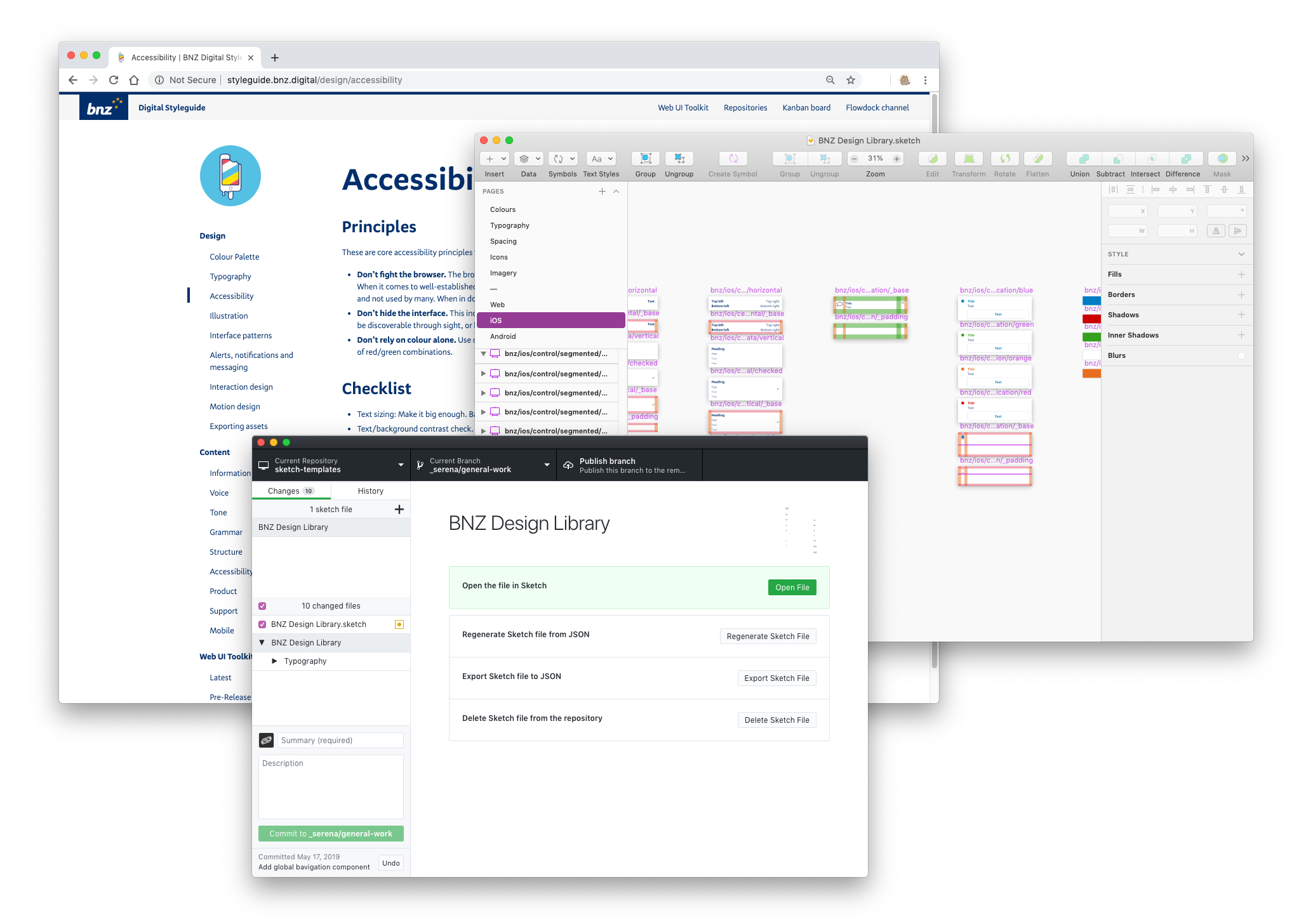
After we were confident that our new login screens would not cause problems for our customers, we started the build. First, I uploaded my designs to Invision, along with styling specs:
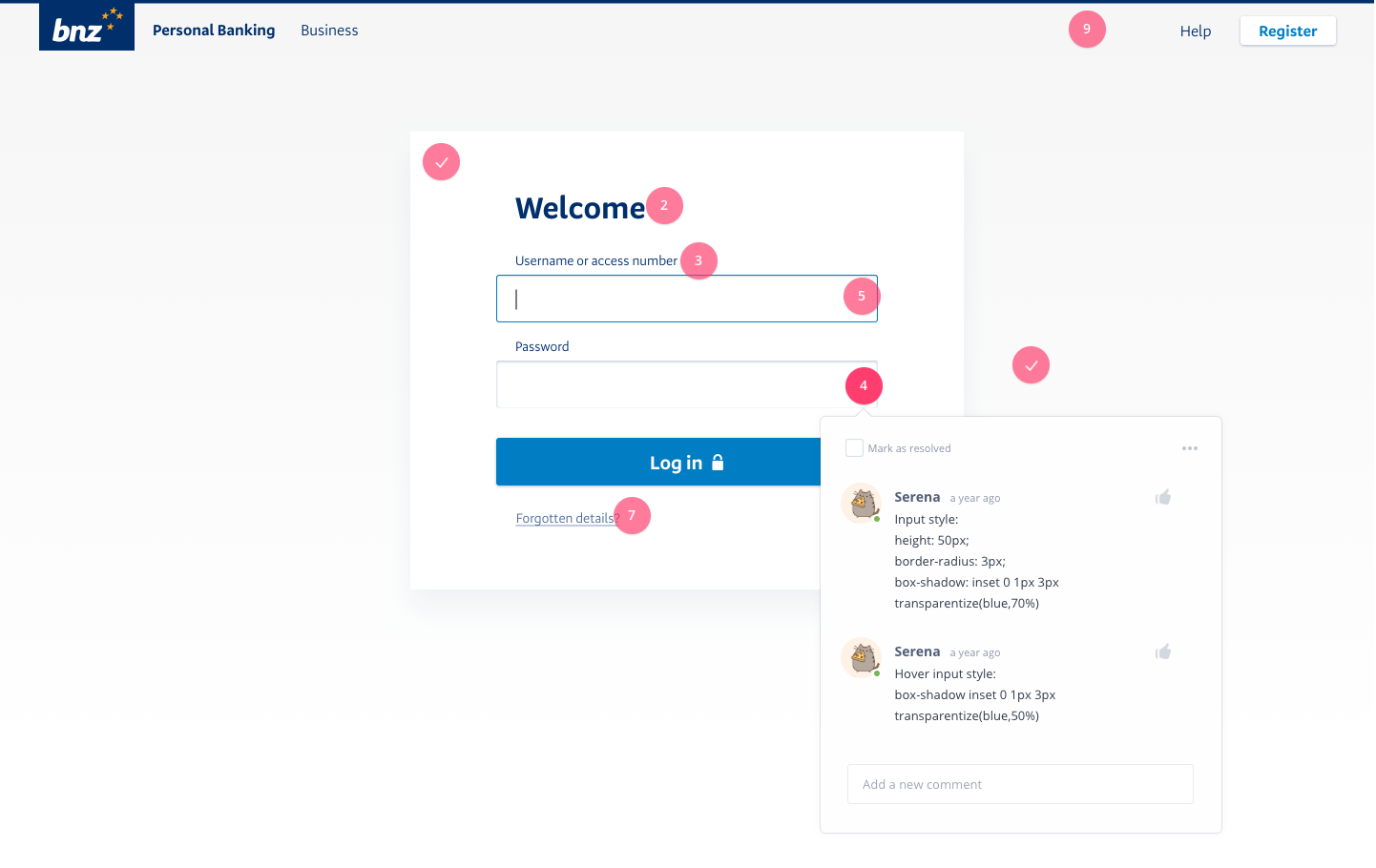
I then sat down with one of the developers on the Web UI Toolkit team, and together we walked through the detailed ins and outs of how I envisioned the front end behaviour to work. Layouts, resizing rules, breakpoint behaviour, and all the margins and paddings and widths and heights.
Results
During this project we built solid foundations for our federated authentication project. Afterwards, we introduced mobile 2FA, making it easier for our customers to step up their authentication.
Surprisingly enough, we didn't receive any negative feedback (or any feedback at all) about our new login screens, which is possibly the best situation we could've hoped for. Once again, our customers are not here to log in — they're here to do their banking, and the login step should take up as little space in their heads as possible. The lack of noise after our initial release is testament to that.
Retrospective
I learned that
- People really don't care what a login screen looks like. If they see a username and password field, they will input their username and password. This explains why phishing catches so many people, even with websites that look drastically different than the legitimate site. This is somewhat worrying.
- People like locks. What can I say? I know an image of a lock doesn't make something more secure. Our customers know this too. But it's an effective communication to signal the boundary between an authenticated and nonauthenticated parts of an application. And clear, accurate communication that reflects true application behaviour to the customer is a plus when it comes to designing secure applications.
Impact
With the introduction of one, consistent authentication style across all applications, we've started the long journey towards single sign-on, as well as customer education around internet security. All of our retail customers have been migrated off our old infrastructure, and a quarter have already updated their passwords within the first
This new authentication app would function as a stepping stone to related work in the authentication and authorisation arena, including open banking features and OAuth integrations.
Lastly, this project came with huge learnings for the Web UI Toolkit team. It was the first application to be built completely using the web-ui-toolkit and functioned as a proof-of-concept for the kit. This project allowed us to refine and improve the developer UX of the toolkit.■