Branch & ATM Locator
Frictionless find
July 2015 – Dec 2015In 2016, our then branch and ATM locator was built and maintained by a third-party, and our contract with said party was about to expire. This gave us an opportunity to redesign the locator and bring it into our main website, which had also recently undergone a redesign.
The challenge
No frills, all function
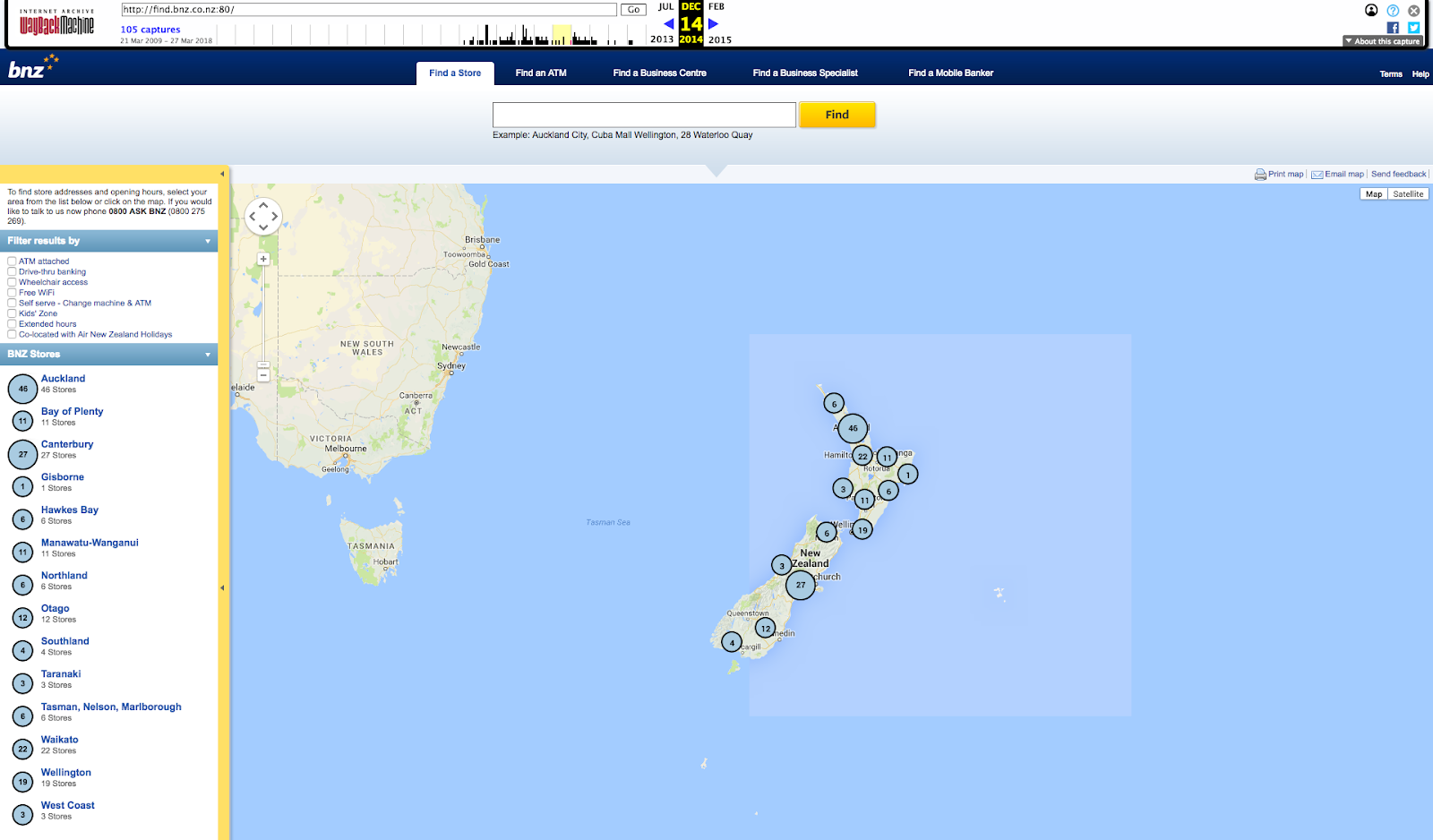
At that time, the current locator website was heavily based on map interactions. It was horribly inaccessible. It was nonfunctional on mobile screens, took well over three seconds to load, and was notoriously confusing to use.
Worse than that: upon closer inspection, we found that many of the entries had incorrect information.
We needed a replacement that was speedy, and functional.
The solution
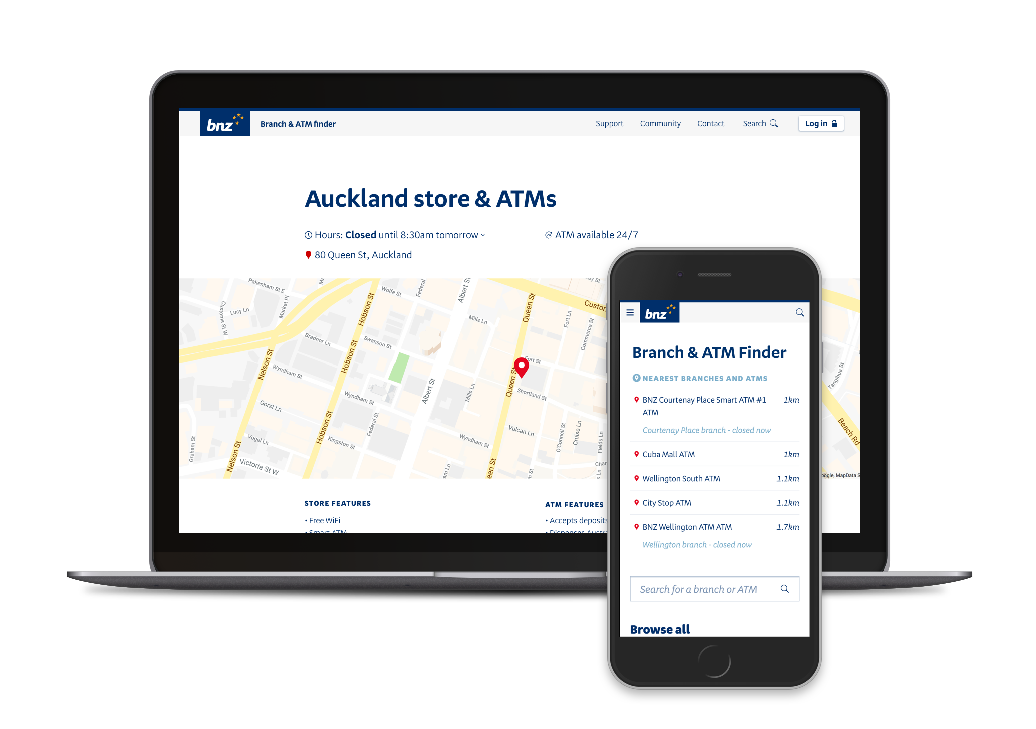
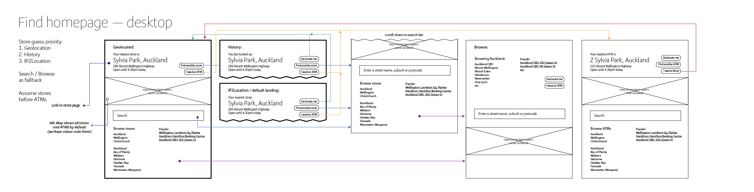
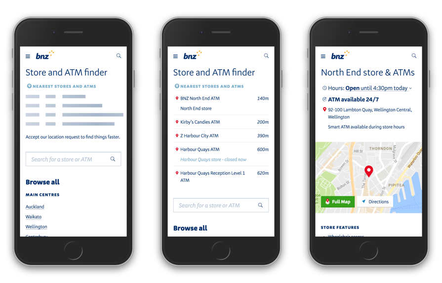
The new locator website would simply sit as a part of our main website. We utilised geolocation to surface the most relevant branches and ATMs as quickly as possible, and made sure our location entries were easily accessible via maps and search engines.
My role
I was the primary designer on this project, working with a senior designer who provided feedback throughout the process. I also worked closely with the product owner and front-end developer on the product team that built and released my designs.
This redesign was first released in 2016, and in 2017 the company underwent a light rebrand. By that time I had moved onto different projects, and a different designer was tasked with updating the website. Since I had been heavily involved in the major redesign two years prior, I supported this designer in a consultant capacity.
Results
Bounce rates for the homepage of the locator dropped from 22.10% in 2015, to 7.42% in 2016, meaning about two-thirds less people arrived at our locator only to immediately give up.
The new locator was loading at around 19.5% faster than the old site (comparing average page load speeds a year before with a year after the release).

Research
In 2015, we did not have access to customers for user research or testing. Nevertheless, that's no excuse to skimp on research.
First: qualitative data. I shopped the current locator around work colleagues and friends and to get their casual impressions and general approaches to finding branches and ATMs. I then mapped out the features of the current locator website to make sure that customers would have their needs met with our replacement locator. Through this I found that the locator site was co-opted for also listing business specialists around the country, and "mobile bankers" (mortgage specialists who would consult with customers outside of branches). Though location-dependent, the locator was not where customers would naturally go to find these details (that were more people oriented, rather than building oriented).
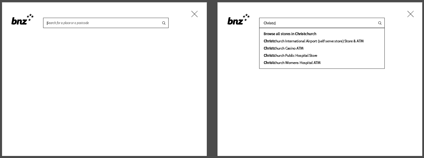
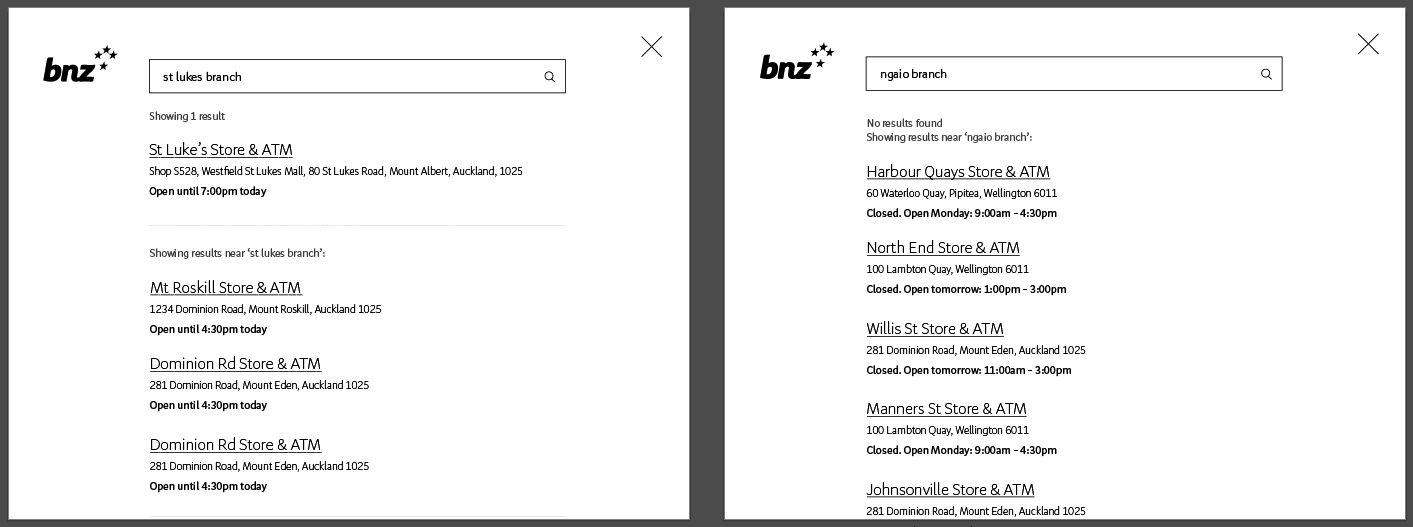
Then: quantitative data. I dug into the Google Analytics for our current locator site and found that the root page was not the most common landing page — far from it. The most common way people landed on the site was to search "BNZ" and their location of interest through a search engine first, then going straight to the page for that particular branch or ATM.
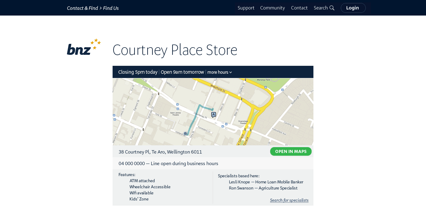
This told me that I should focus my efforts on the design of the individual branch and ATM pages, and not worry too much about higher-level views such as the landing page, or region pages.
The data also verified what I had suspected: the most common search query was around opening hours of branches on weekends, followed closely by when a branch would close today.
I also did some competitor research, though to be honest, none of the banks had particularly good locator. I did however notice that Google Maps had some good patterns when it came to displaying information about a building, and borrowed heavily from that.
Assumptions & tradeoffs
Since we only had a few months to deliver this, I knew we had to streamline our solution.
Map interactions
Maps are a special class of interaction where, if you get it wrong, it is annoying as h*ck. This is especially key on mobile, since you really don’t want the user awkwardly trying to pan around in a non-performant map inside their browser.
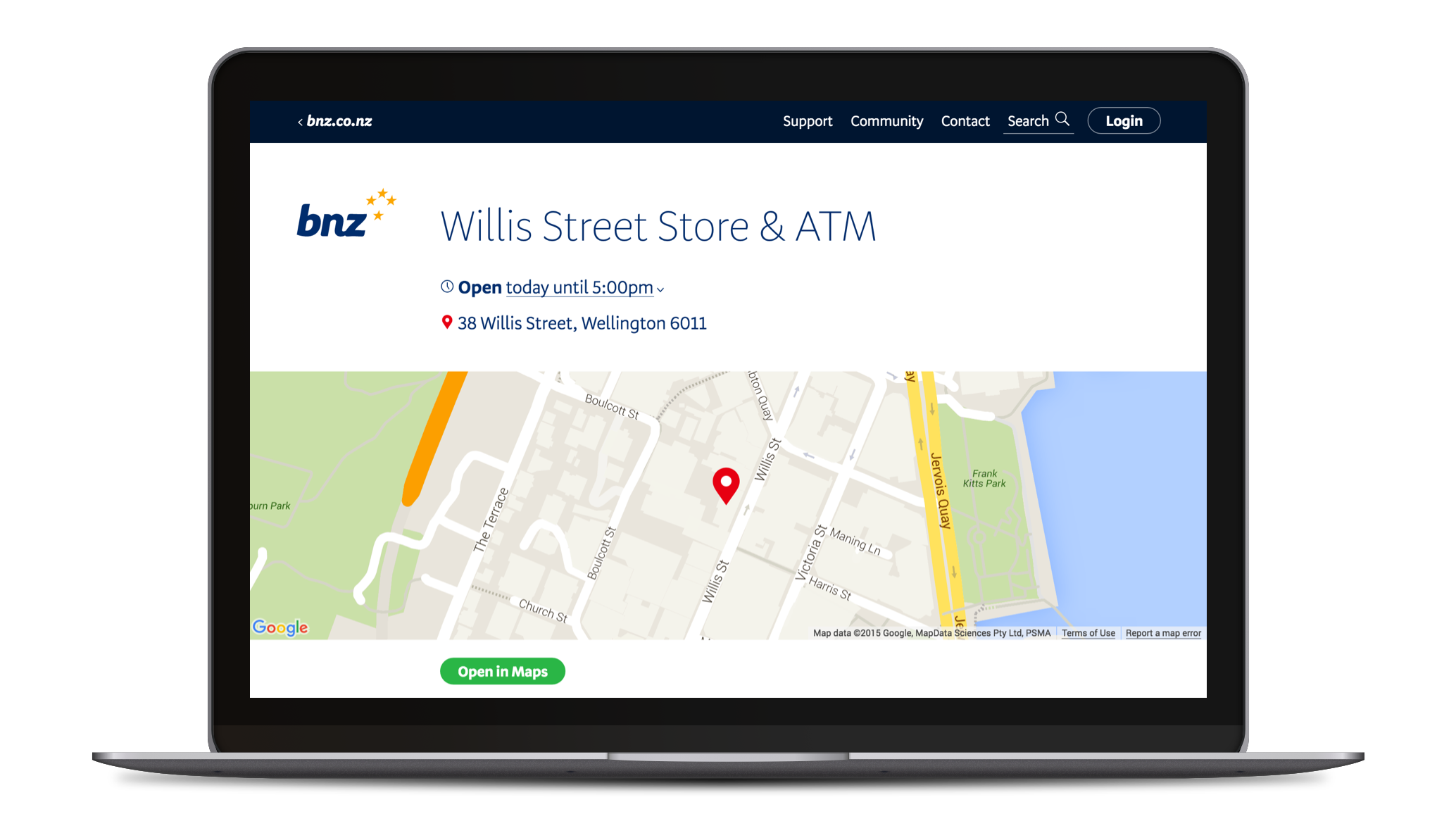
Therefore, I opted to display only a static map, zoomed in enough so you can see nearby main streets to orient yourself. When it comes to finding directions, I chose to encourage the user to open the address in their preferred maps application. I assume that people know how to use mapping applications elsewhere and that they would prefer it anyway. This frees us from having to rebuild wayfinding features in our website (which was never going to match the quality of dedicated map applications, anyway).
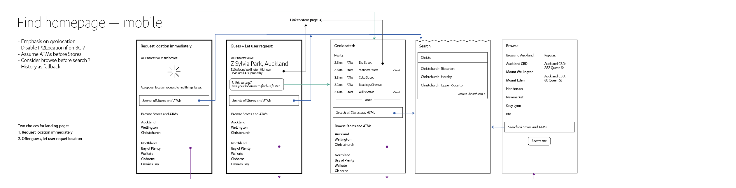
Location permissions
I wanted to be careful with asking users for access to their physical location. Especially back in 2016, the idea of giving a website access to your personal location was still new, and many users were uncomfortable with the idea (and many still are).
On the other hand, it was also clear from informal conversations and observations, that the main thing people would look for was the branch or ATM that was closest to them. This is easily solved with knowing the user's current location, so I knew I wanted to leverage that.
In the end I opted to ask for location information in the mobile view, but not in the desktop view. People were more familiar with allowing access to their device's location on mobile, and had good cognitive foundations to understand the risks and benefits related to that.
Scoping
In consultation with the product owner, business analyst and design team, I sketched out a rough scope for the project:
Must
- Branches
- ATMs
- Available hours
- Street address
Should
- Show map
- Integration with bnz.co.nz search
- Geolocation
- Feature list
Could
- Partners centers
- Integration with website widgets
Won't
- Business specialists
- Mobile bankers
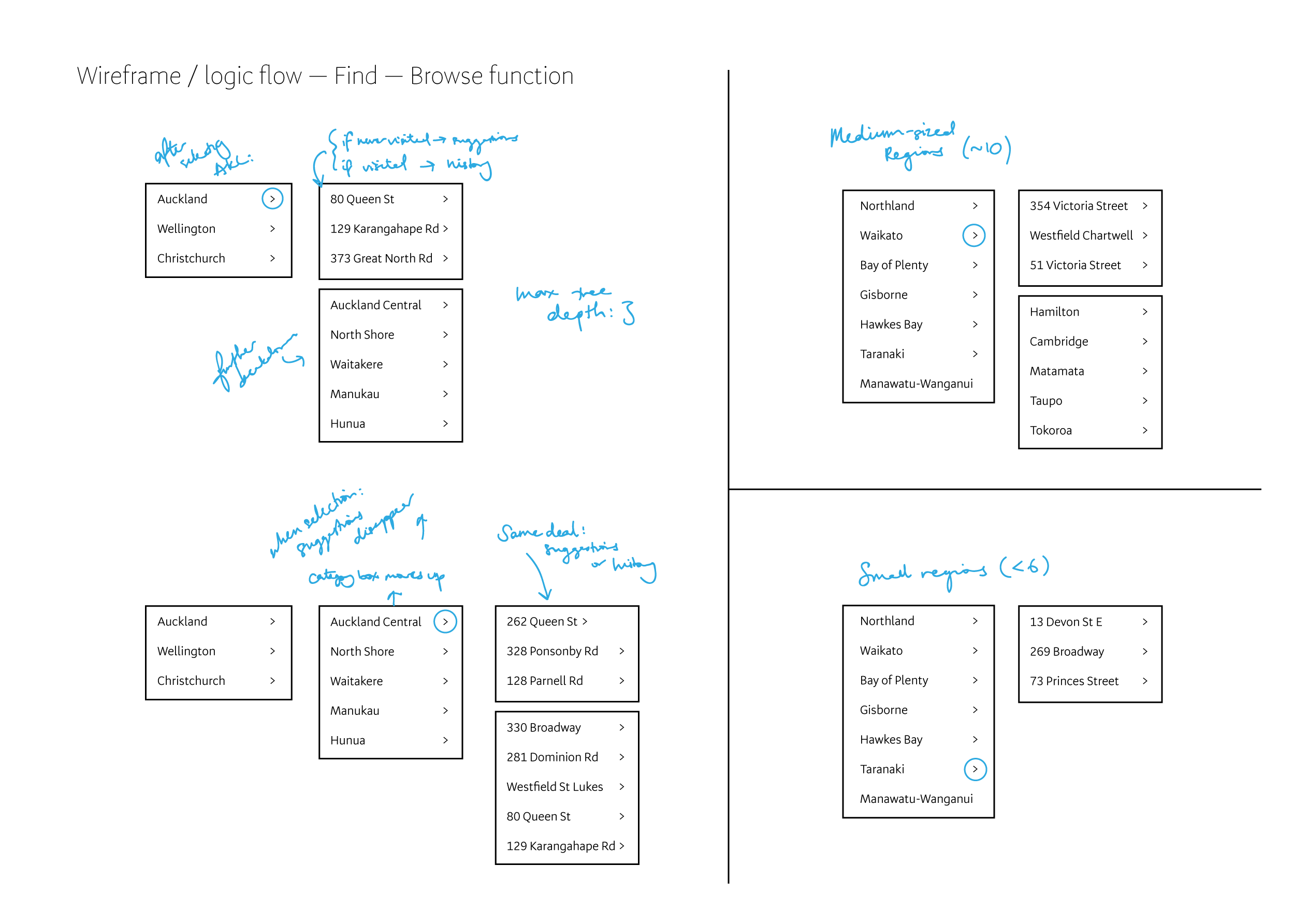
Wireframing & testing
I then underwent about three or four iterations of wireframing and testing, asking colleagues to tap through paper printouts of the screens while I observed their behaviours and comments.
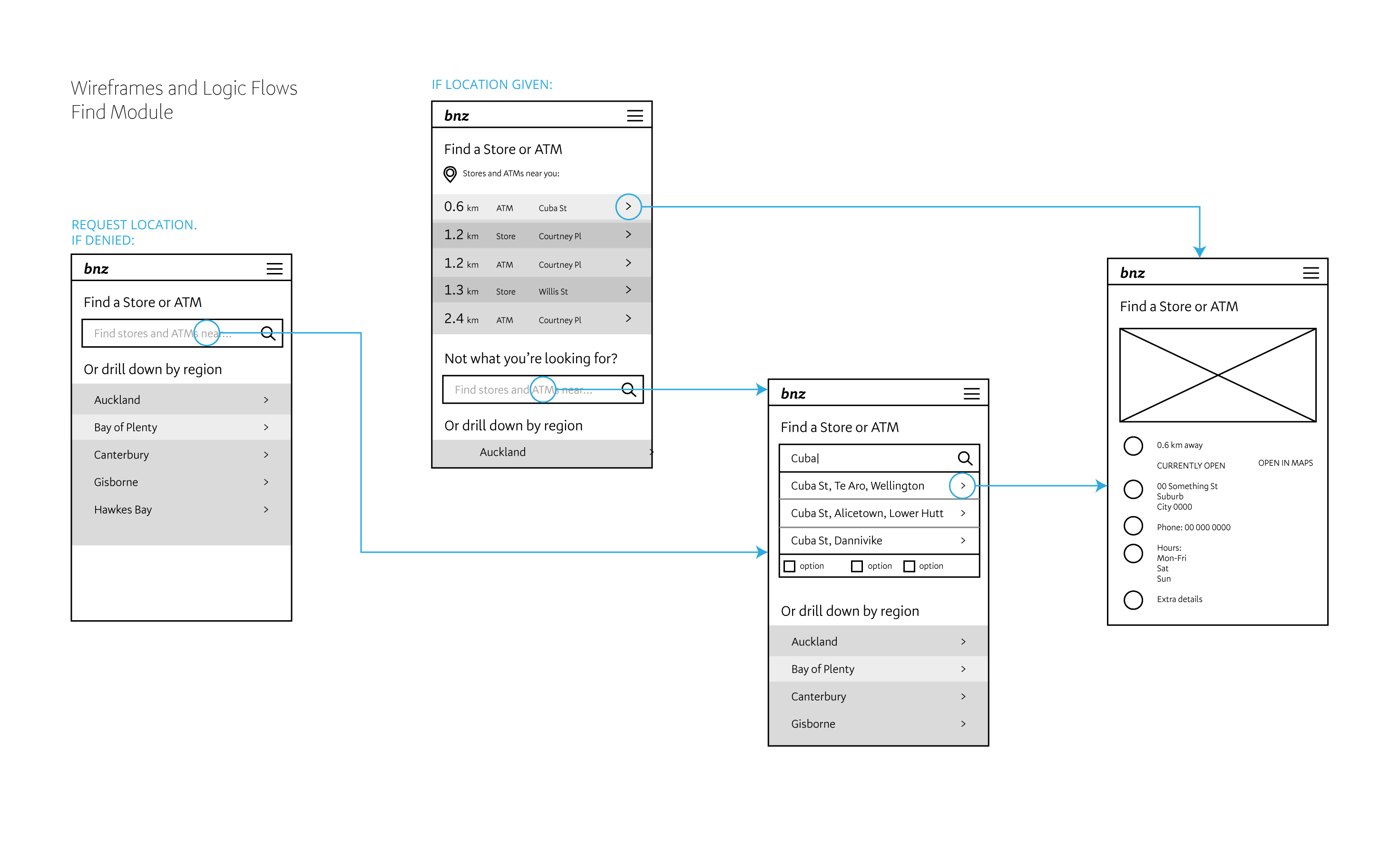
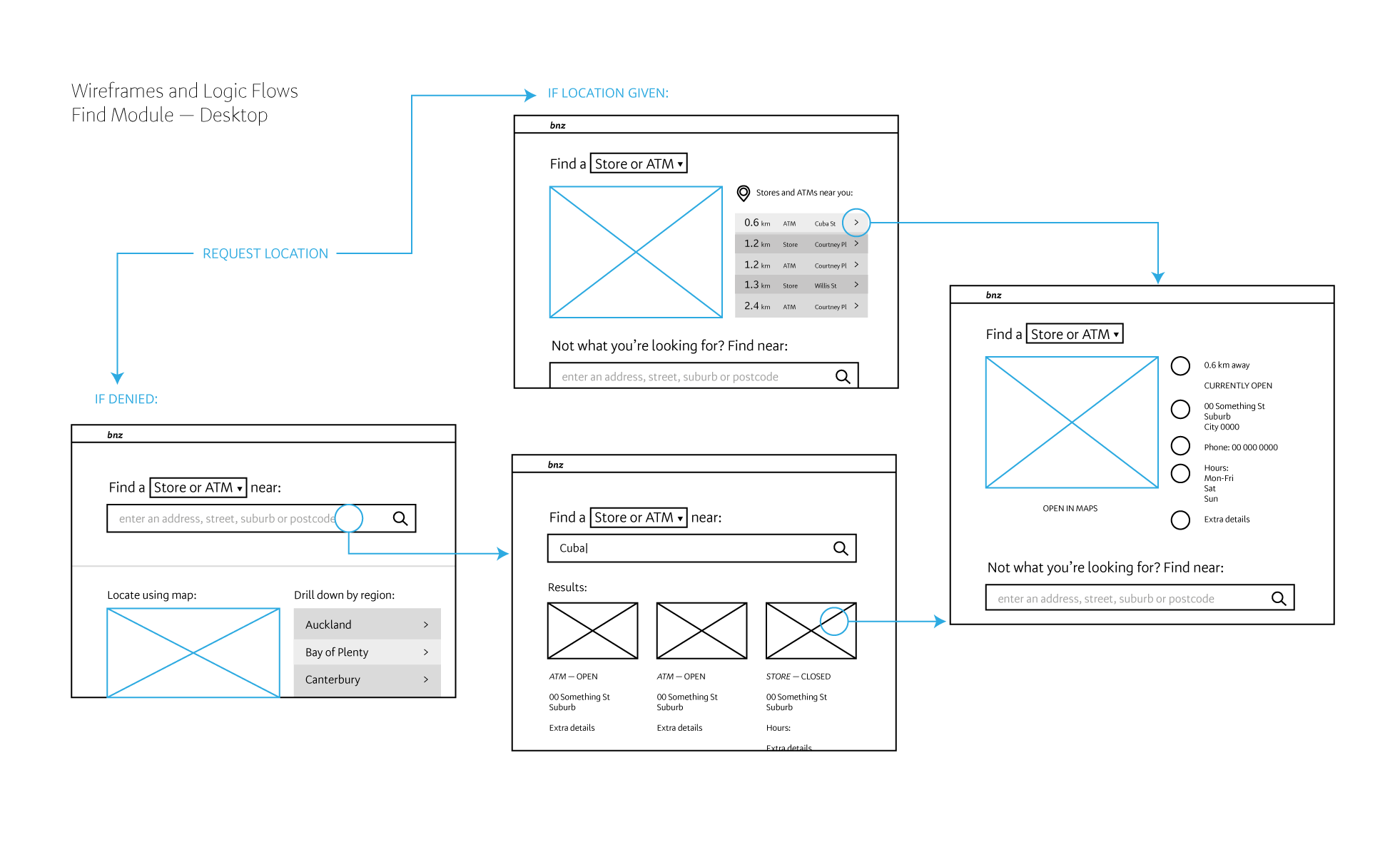
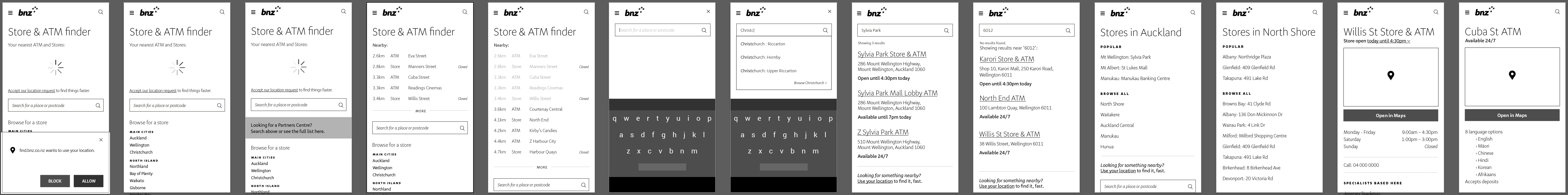
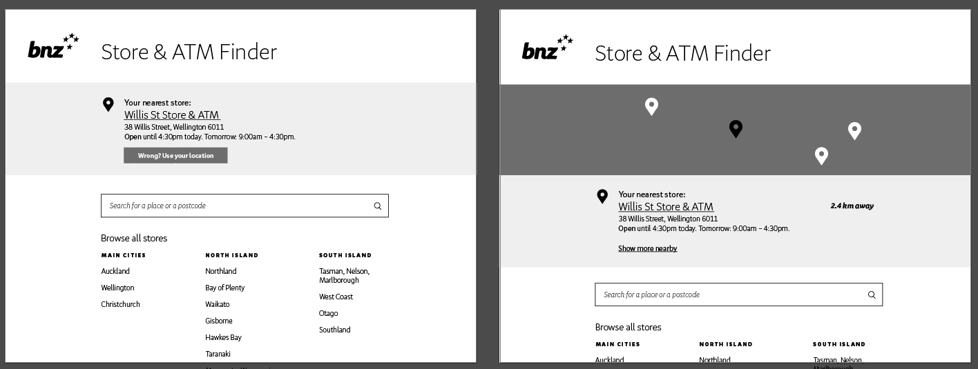
As expected, people felt comfortable giving their location details on mobile, but reluctant on desktop. People also seemed to have trouble locating hours of a branch when it was visually grouped with all the other metadata about the location entry. They also indicated that hours were the most important piece of information they were looking for, so I made sure to separate it out and give it prime position on the page.
After I felt confident in my interaction descisions, I moved onto refining the visual design of the locator.
This would then go through many rounds of refinement as I sought feedback from my design colleagues.
Refine, Release, Rebrand
I continued to workshop my designs around the design team, and guerrilla tested some with people in the wider company. I kept refining until I was happy with my designs. I then worked with the product owner and front-end developer to build the designs to spec. After the mess that was the lack of accurate ATM data, this was smooth sailing.
After the release, we monitored the feedback widget for any signs of trouble. Nothing. I guess no news is good news!
About a year and a half later, BNZ would undergo a significant brand update. I worked with fellow designer Allan Mansfield to update the designs for our locator to the new brand guidelines. Here is the finished result.
Retrospective
I learned that
- MVPs are a great way to get something functional out the door, and a great way to get feedback and data quickly. However, this project suffered from something that I will see many projects suffer from: the "MVP-and-ditch". We never came back to the locator after releasing the MVP. From then on, I understood more clearly when projects were simply not a priority (thus making an "MVP-and-ditch" somewhat okay), and when an MVP was simply being used as an excuse to deliver poorly on a project that was of importance (which is when I would make sure that the team was committed to coming back and iterating on the project).
Impact
I'm not sure how to say this eloquently, but the new locator was actually functional. The information was accurate, the information architecture was straightforward, and listings were optimised for search engines (the primary traffic source for the locator).
Our bounce rates for the landing page of the locator went down by 66.4%, which I suspected was helped in no small part by the replacement of the unwieldy map interface with a more direct, functional search.
Moreover, we became the "source of truth" for all branch and ATM locations, providing an API for our mobile apps and a CMS for our staff to manage these locations.■