Design styleguide
The writing on the wall
May 2016 – Sep 2017, Jan 2019 – Jun 2019During my time at BNZ Digital, the design team more than doubled in size. As this happened, so did our communication overheads. Long discussions would break out about the same topics, over and over again. We were constantly reinventing the wheel, and there were inconsistencies everywhere.
I drove and designed for a "styleguide" initiative that included the Styleguide website, and a version-controlled Sketch asset library.
This is the story of tackling design debt.
The challenge
Documentation as culture
While most people are familiar with design systems (usually a collection of plug-and-play elements), what seemed to be missing for me amongst the wider design community was a focus on higher-level documentation and systematizing design decisions. So, while creating a design system as on the books, I focused the first chunk of time and attention towards building a culture of documentation, sharing, and thinking about the long-term health of our design patterns.
This case study covers two tracks of work: first, the documentation and systematizing of design decisions themselves, as well as high-level design patterns. Second, the plug-and-play design system resource.
These two pieces of work is a part of the wider Styleguide initiative, which I pioneered at BNZ.
My role
I was the primary designer on the styleguide project. I also built the different versions of the styleguide website, with some help from our devs on the styleguide core team.
While I led the project, and carried out much of the documentation, asset collection and reconciliation, I must thank my colleagues for their patience, generosity in their time, and perceptive feedback.
Shoutouts to Allan Mansfield (design lead for our website), who gave valuable feedback on the Sketch component library I was building. Kudos also to fellow designer Sharlene Clark, who did a complete audit of UI elements and screens in our Internet Banking for Business application (which, for an application as complex as our Internet Banking for Business, was an absolute godsend). Kudos to Claire Jaycock (Design Director), who contributed documentation. To Anton Di Leva, who was working on the mobile counterpart to the styleguide project. And to Brent Neave, the incredible designer who I'm passing the mantle onto as I prepare to leave BNZ.
Research
Conducting informal interviews with my fellow designers revealed notable pain points such as the following:
- Knowing which version of something to use was a huge pain point. Oftentimes it would be difficult to discern the most recent design patterns to use, and would involve manual investigation in production, as well as nagging fellow designers for recent Sketch files.
- Designers would be either completely unfazed or completely paralysed by decision making — there was seldom the middle ground. We needed patterns that were both strict enough to enforce consistency, yet flexible enough to apply to different cases and contexts.
- Designers, much like their developer counterparts, wanted to be included and contribute to global decisions, yet lacked the time to do so. Our solution would need to balance ease-of-use with completeness of documentation.
Combined with my research for the Web UI Toolkit, I dove deep into the online literature around styleguides, component and pattern libraries. From my reading I learned the following, from which I derived what success would look like:
- Styleguides are straightforward to create, but difficult to maintain. For this initiative to be successful, we will need to continuously tend to our garden.
- Styleguides are often created as a showy PR piece, but lack significant uptake. If our styleguide is to be successful, our designers must want to engage with it, and find it genuinely useful.
- Component libraries span a multitude of technologies, but much like the case for developers, the technology itself is less important than sticking to something everyone will use.
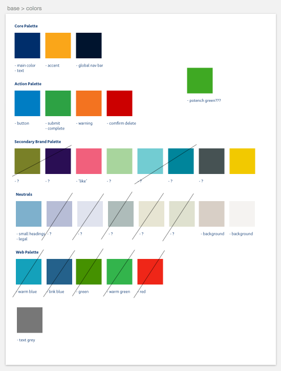
Stocktake
As yet-another-case-study-about-styleguides, you probably know how this goes. I started collecting every piece of UI in every production environment I came across.
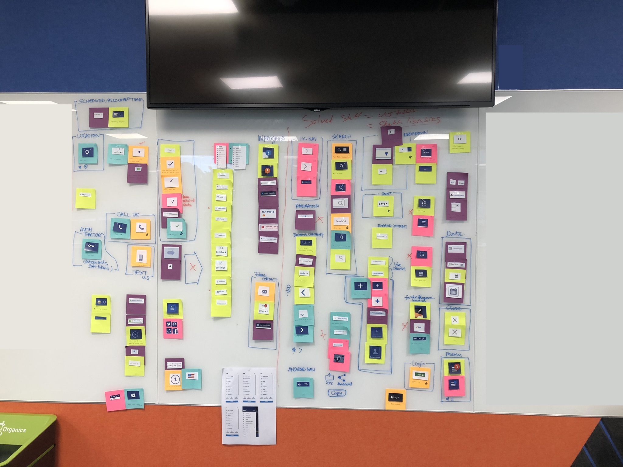
The UI collection was boring, but easy. The harder part was collecting interaction and general design patterns. For this I started multiple Trello boards — pasting in screen shots while noting down internal logic and behaviours.
Creating consistencies
After we felt like we had a good collection of all the elements and patterns in the current state of all of our applications and sites, I started to reconcile these down into "official" versions, with one or two variants. While I was doing this, I would constantly be seeking design team feedback. It was a slow-going process, but I believe creating consensus would make the success of this project more likely. As always, a styleguide is no styleguide if no one abides by it, so it was crucial to me to have the whole team's buy-in.
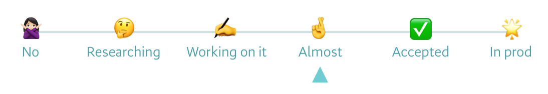
To give my teammates a better sense for my confidence level around my explorations, I made a little "confidence meter" that I would attach to the corner of progress updates. This showed how close we were to consensus.
After coming up with good candidates for UI, interaction patterns and the like, I would put these through some decent testing. Consensus does not guarantee a good decision — it guarantees a popular one. It was important to me that the decisions we were making were also fit for purpose. Visual motifs must serve the gamut of stories we must tell. Interface elements must withstand different contexts, devices, and usage styles. Interaction patterns must be intuitive and not unexpected. Information architecture had to make sense across our different applications and websites.
Documentation
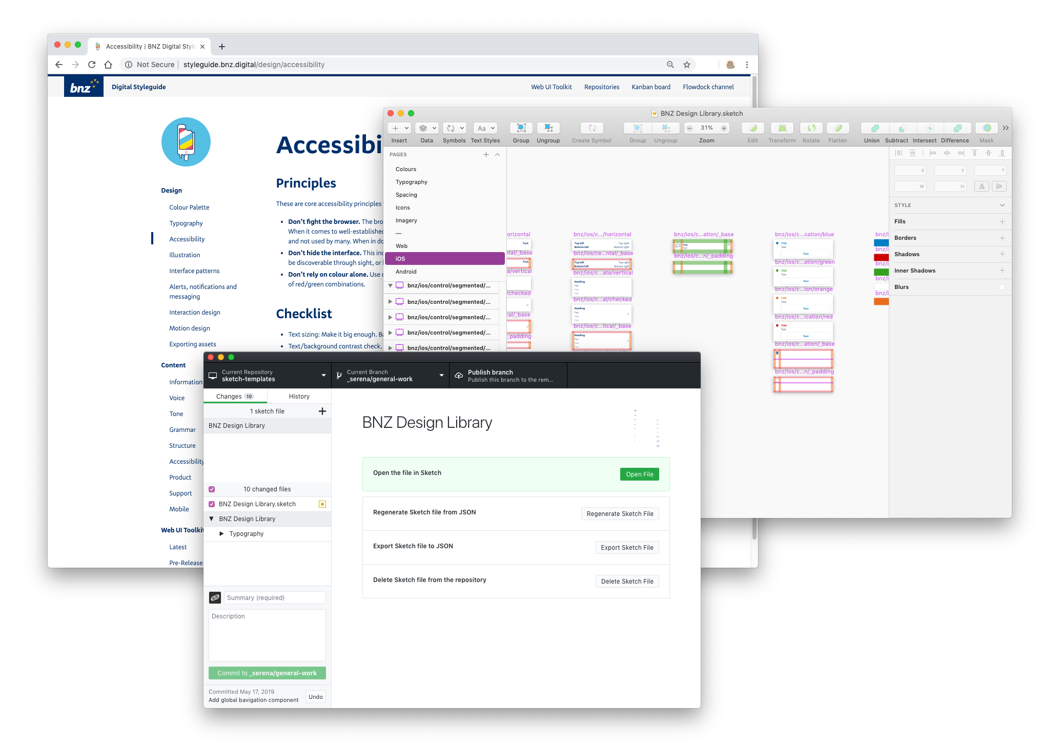
To document our design patterns, I initially created a static site using Jekyll, as well as a master Sketch file with all our UI components as symbols. I knew that these were not the best tools for collaboration, but I wanted to get something up on our internal servers quickly (I didn't have time to make CMS templates), as to not lose momentum.
This would turn out to be a good approach. As soon as the design team could view an early version of the Styleguide and its corresponding Sketch components, they could give feedback on content and approach.
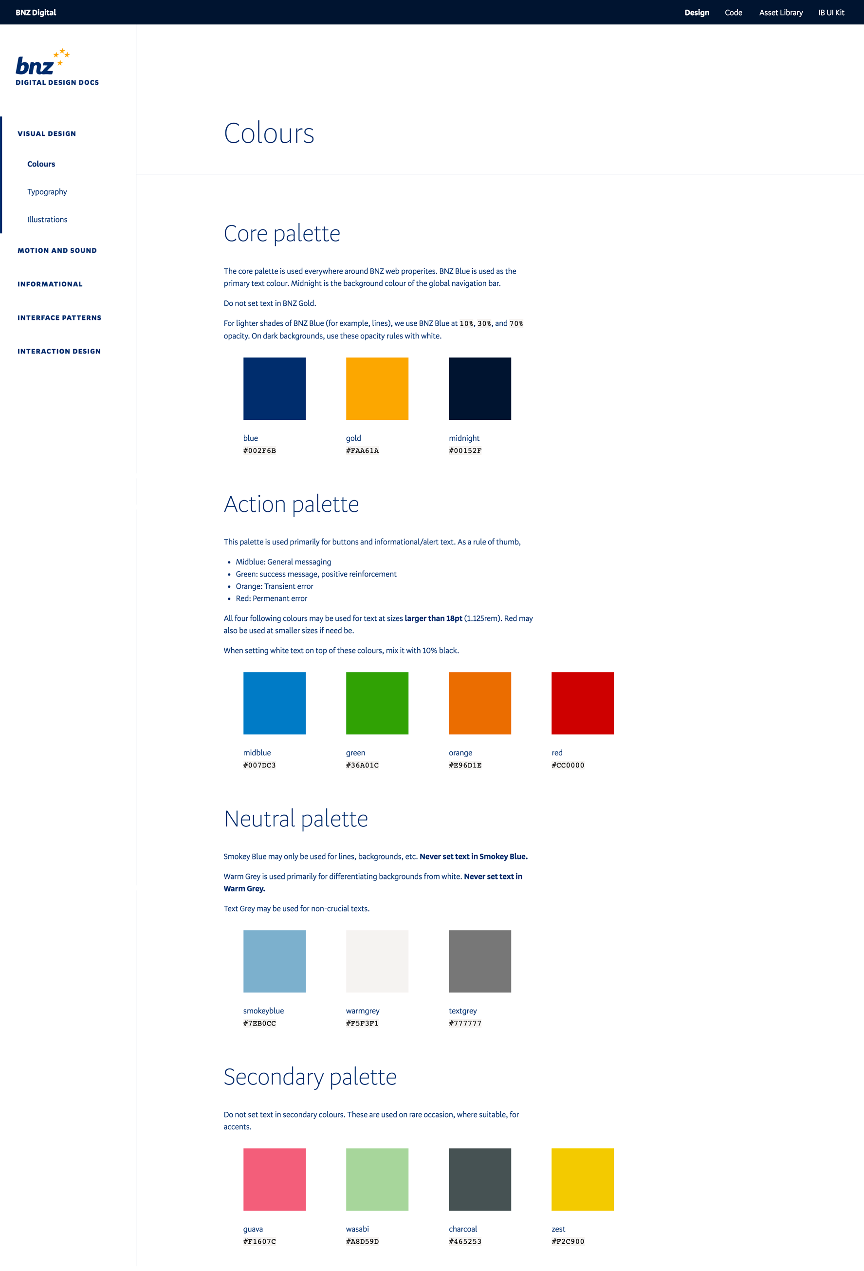
Now, that a proto-version of the Styleguide was up, people started wanting to contribute. This was great. To facilitate this, I started building out a new Styleguide site, based on SilverStripe (the CMS our main website runs on).
Then, a bump in the road. While the design team were eager to contribute to the Styleguide, we did not have time to do so. Each designer services a handful of teams simultaneously, and tackling design debt was simply not a priority compared to the needs of our delivery teams.
And design decisions were hard. Even seemingly small discussions would take at least half an hour, easily stretching to an hour. We all had high commitments to quality and consistency, and we understood every decision would have flow-on effects.
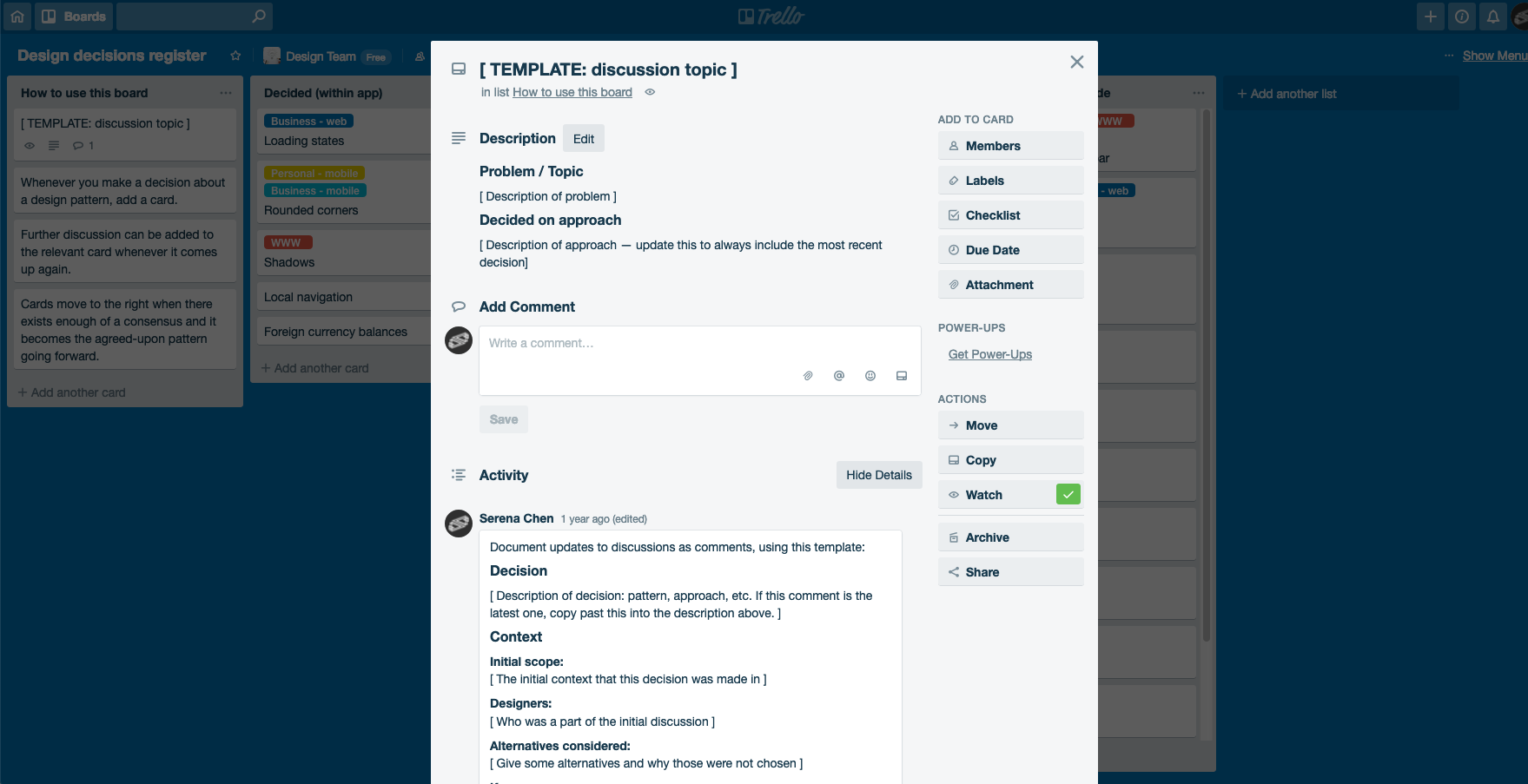
Moreover, contributing directly to the Styleguide website was intimidating. When a designer had an opinion, they often did not have time to build consensus, so did not feel comfortable updating the styleguide. We needed something more welcoming.
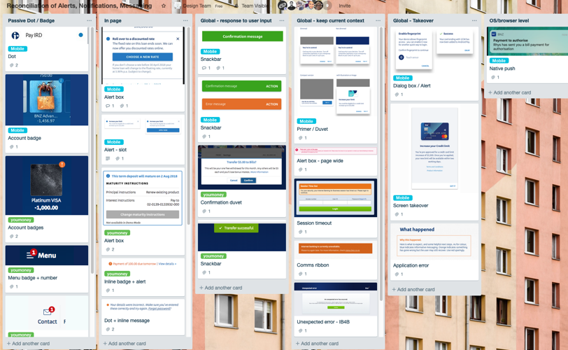
To try and meet my teammates at where they were, I created a Trello board to act as a decision register. Discussions on a topic would warrant a card, and as those decisions build consensus throughout the team, the card would move to the right, eventually ending up in the official Styleguide.
The snake eats itself
After we had nailed down enough components and patterns to form a kind of "starter kit," it was time we put our own theories to the test.
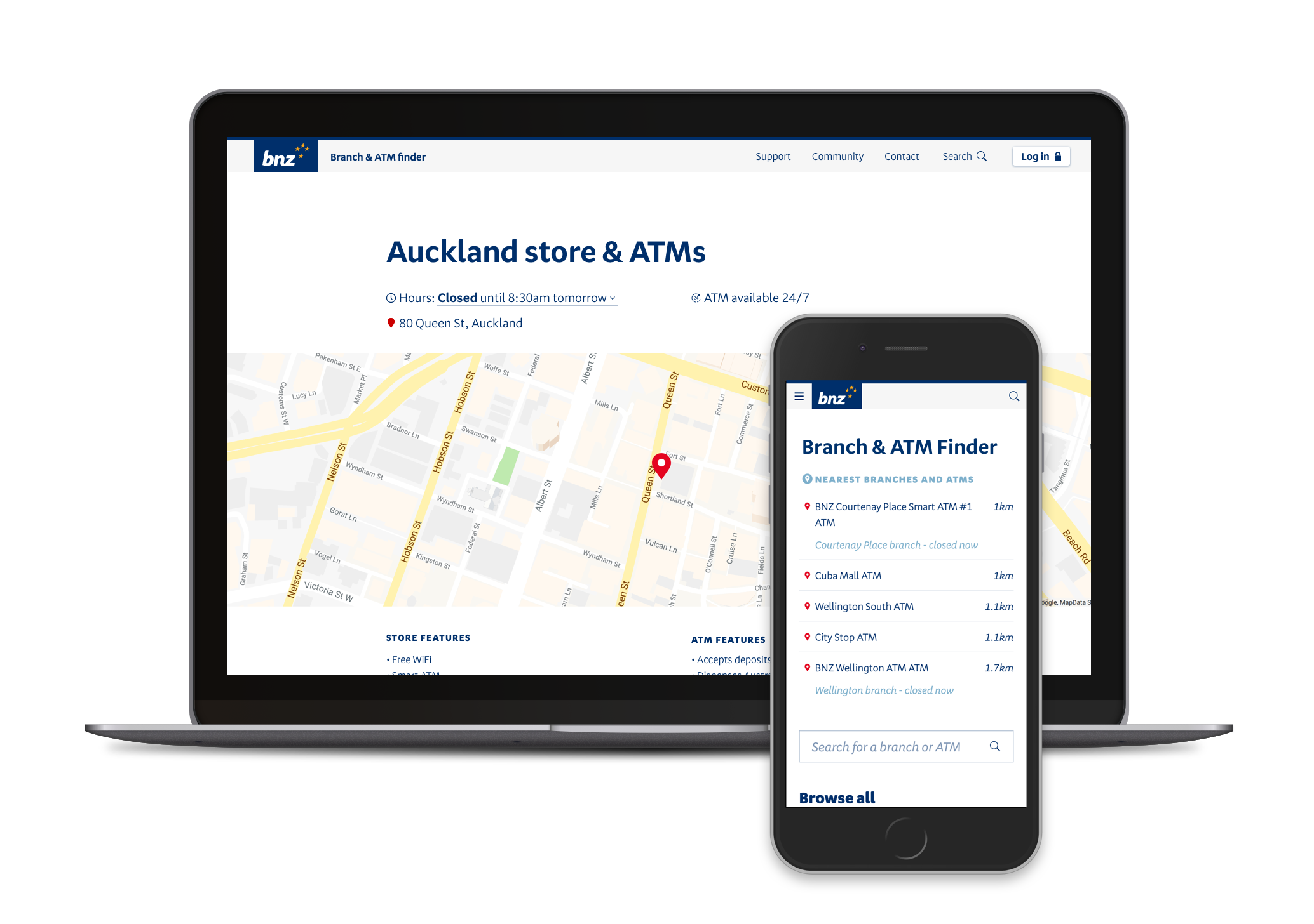
As a first step towards unifying all our web properties, I created a global navigation component and pattern. This went into production in the main website, the Web UI Toolkit, the Styleguide, the Authentication app, and Internet Banking for Business.
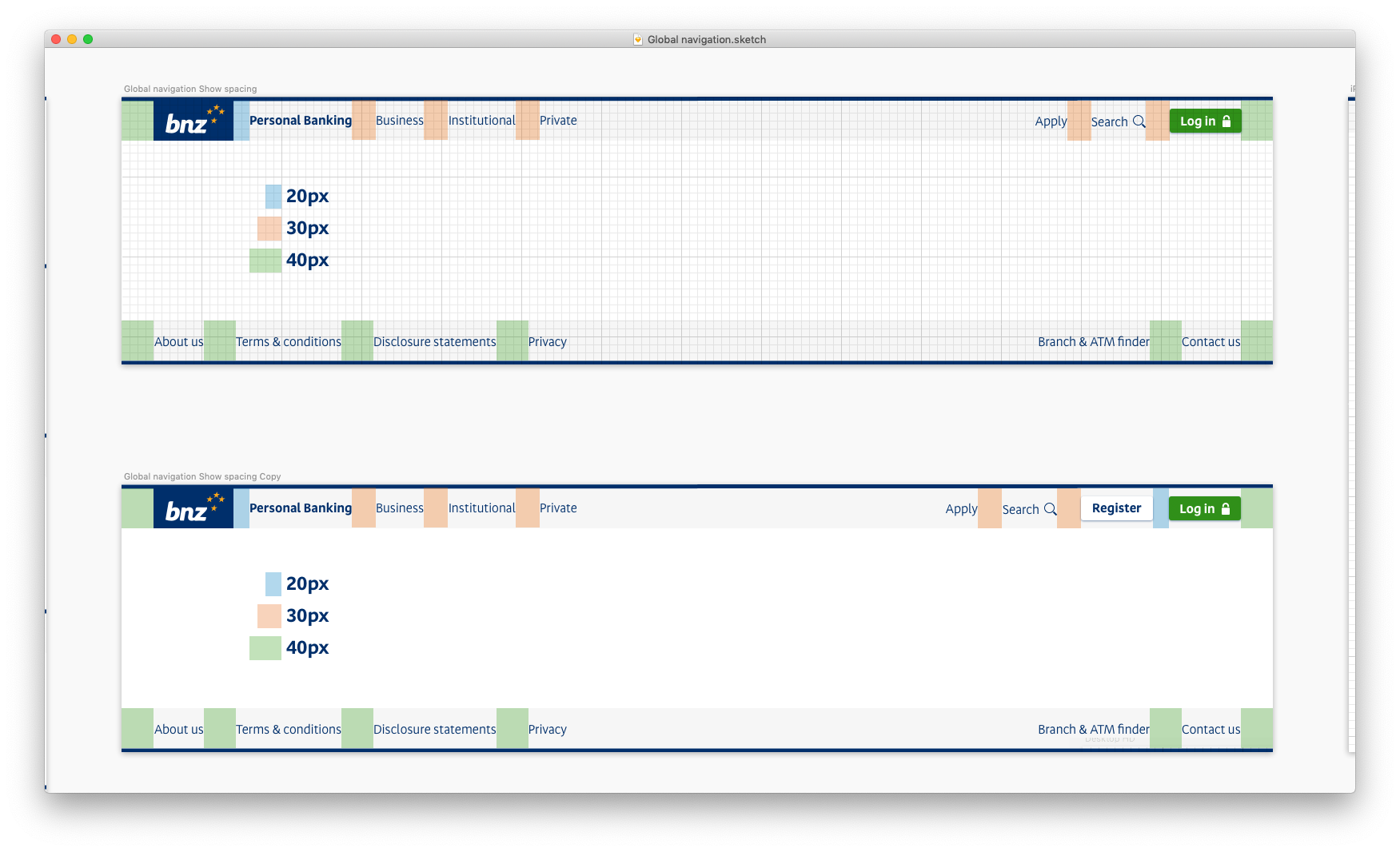
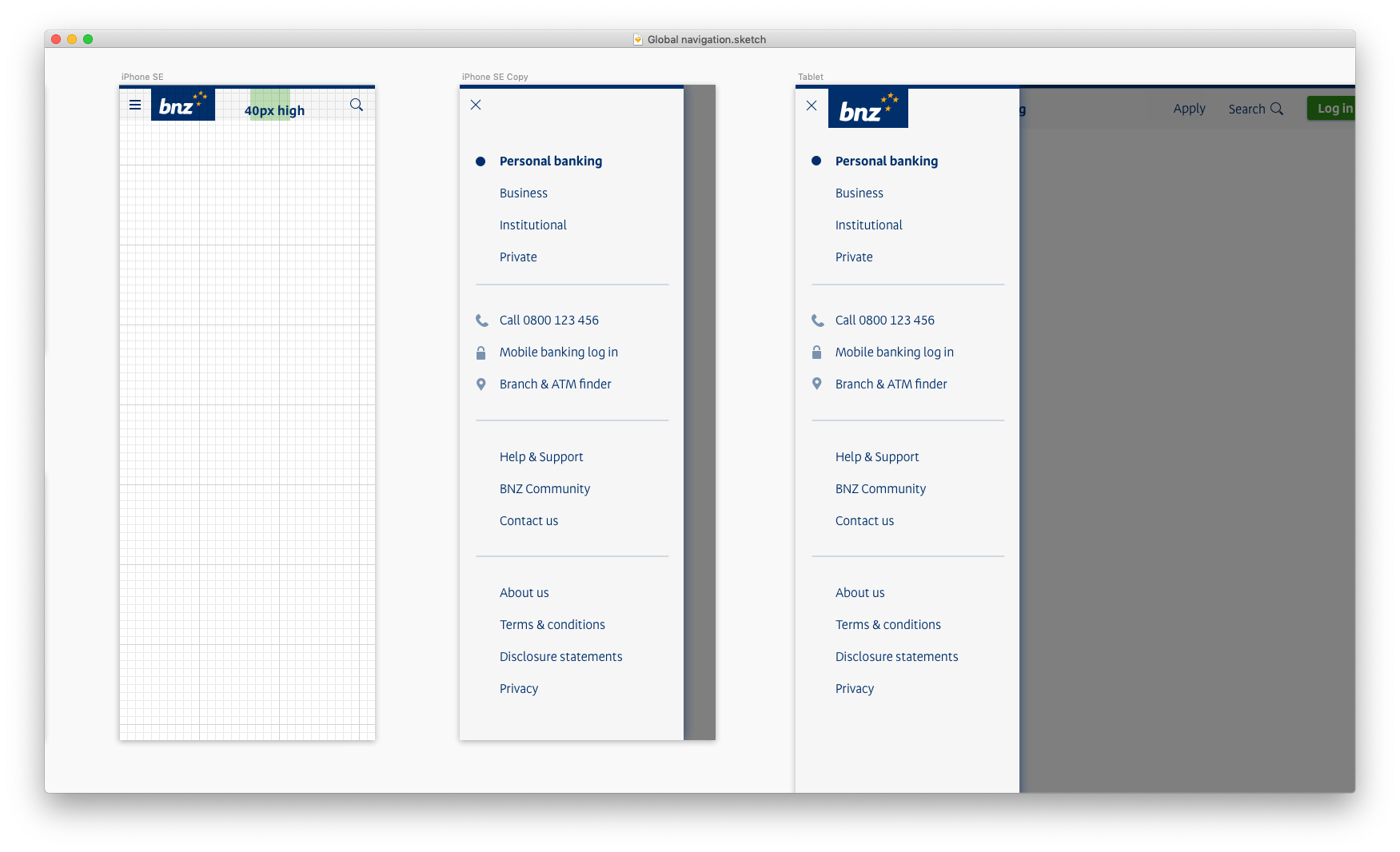
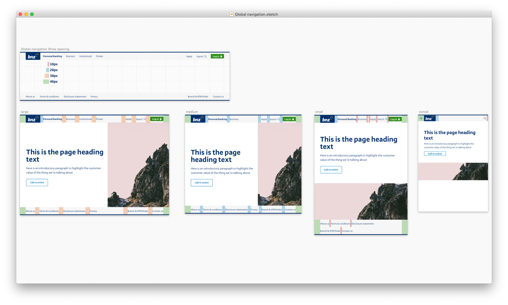
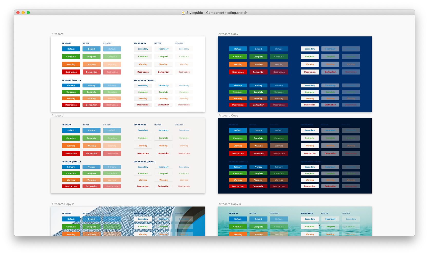
This was also a good test of our baby asset library, which made mocking up webpages in Sketch a breeze:
This component was introduced in consultation with the rest of the design team, and went extremely well. It was a robust component that stood well for the different needs of our numerous platforms, while introducing a unifying visual motif.
As time went on, we started bringing in contributors to the styleguide from the wider design and experience team. This included our friends from the Digital content teams, who contributed their voice and tone styleguides, as well as various guidelines on writing specific UI copy.
Design system part deux
After embarking on some research with fellow designer Brent Neave, we found an open-source Sketch git tool called Kactus. This allowed us to version control our Sketch files, and most importantly, our Sketch Library.
In the long term, the plan is to render our Design System from components from our live React web-ui-toolkit so we wouldn't have to keep syncing between the designs and live components, but for now we simply ported over our design system components from Invision DSM to a vanilla Sketch Library, and set it up to work with Kactus.
The most important thing that we had to accomplish at this point, was to educate our fellow designers on git workflows, and how to work with Kactus. I wrote up detailed documentation on install, setup and workflow, and personally walked my colleagues through the process.
Using a git-based tool has several advantages — not only is everything version controlled, we get the processes that go with creating pull requests, allowing our designers to feel more confident to contribute to the design system without the fear that their work might get incorporated without sufficient consideration.
Retrospective
I learned that
- Gardening (i.e. tackling design debt) is never a priority unless you explicitly make it so. Everyone agrees that it is important, but no one wants to do it.
- Contributing to the styleguide must be accessible enough so that anyone can do it, but formalised enough so that people feel the responsibility to contribute.
If I had six more months, I would
- Add guides from our UX Research team, who have done a wealth of work around educating delivery teams about UX research — why it's important, how to conduct it on a regular basis, and how to analyse their finders.
- Try and get the Web UI Toolkit to Sketch component tool chain working. Manual updating of components is simply unsustainable with a design team as small as ours and a workload as large.
Impact
Creating a culture of documentation is hard. Though we successfully created a styleguide, asset library, and tools and processes for documentation and asset sharing, we have a long way to go. What makes a styleguide successful will be its continued use and relevancy, and while the Styleguide was continually being referred to and the asset library used occasionally, we still need to get it to a point where it is deeply embedded into all designers' workflows — like second nature, a tool that is used without thinking. This is something I'm still working on.
However, what this did succeed in cultivating, was a general understanding that though we work on different platforms, different operating systems, different business units, we must all converge on a shared design language. Before the styleguide project, designers worked in silos, creating bespoke everything. Now, we are all more considered in our decisions, and understand how our designs fit within the larger picture of BNZ as a single organisation.■